|
|
fred79


Disgraceful
Undefeatable Hero
|
 posted March 04, 2014 09:12 PM
 |
|
|
imo the home of the bat building needs both sharpened(20-35%) and increased contrast(slightly). it lacks definition, which happens sometimes when you shrink something.
i like how you used the seagulls def to make the bats. and you cut some frames too, to give the appearance of a more bat-like flying pattern. good job, you almost don't recognize them. 
|
|
Salamandre


Admirable
Omnipresent Hero
Wog refugee
|
|
posted March 04, 2014 09:38 PM |
|
|
I agree about bat home, 3 times I asked you if you want to sharp/contrast. 
I need rest now, half of my 1 week holidays is gone and did nothing but work on defs.
Later. 
|
|
fred79
Disgraceful
Undefeatable Hero
|
|
posted March 04, 2014 10:59 PM |
|
|
|
i thought you just wanted me to cut it out for you. that's why i didn't **** with it. i was wondering why you wanted only a menial task from me.
|
|
kswdiy

Adventuring Hero
|
 posted March 05, 2014 03:23 AM
 |
|
|
Salamandre
Waitting for you£¡
Good! Thang you!!!
|
|
Salamandre
Admirable
Omnipresent Hero
Wog refugee
|
|
posted March 05, 2014 06:27 PM |
|
|
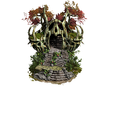
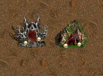
Ok, let's see about adventure cave. I have nothing which fits 100% so the only solution is to surgically combine parts and see how goes.
Starting material:
Modifications (no animation yet):
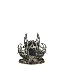
The animation will probably consist in eyes inside the cave, + some skulls at entrance. But what bothers me is the upper part, original is rather green, after playing with settings, becomes closer to bottom but textures now vary. Fred, do you think you can achieve a different result? You can use the starting material png here.
Another possible model to start from:
Or, already done, but with a different animation color (much darker)

____________
Era II mods and utilities
|
|
fred79
Disgraceful
Undefeatable Hero
|
|
posted March 05, 2014 07:02 PM |
|
|
i'm actually working on replacing the summoning stones at the moment, i came back here to let you know that.
what i am working towards, is using the exact same setup for the old one, just with different graphics. so far, i have fixed the oval summoning spot, and have tried filling that layer with space(blackness, stars); and also with a redone whirlpool graphic. i would like to have some kind of portal animation for it, with little bits of light coming off of it, and up into the air, kind of like a fire with sparks rising out of it. i haven't yet looked for suitable stones for it yet. they can be filled in easily, after i find the right summoning spot graphic. i'm debating on whether to add a base to it, like a rock table, or to lower the summoning point to the ground. that's what i'm up to right now. i'll get back to you if i make progress with anything.
|
|
Salamandre
Admirable
Omnipresent Hero
Wog refugee
|
|
posted March 05, 2014 07:12 PM |
|
|
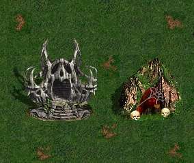
Here is summoning stones object I have from Astaroth. I see no point in working on another unless we can do better. The actual adventure cave sucks because it uses mountains as background. Put it on other terrain than grass/dirt and it looks alien, no matter what you add around.

|
|
artu

Promising
Undefeatable Hero
My BS sensor is tingling again
|
|
posted March 05, 2014 08:22 PM |
|
Edited by artu at 20:27, 05 Mar 2014.
|
The one right above will again look weird on lava, underground etc etc. The original def is simple but not ugly, so unless something really good and compatible comes along, I say leave it as it is. Fred improving the original is a good idea.
Among the previous ones you displayed, this is best:
Btw, with too many objects animated, wont crowded maps tire your eyes?
The cave with hands over head: Death Chamber
|
|
bloodsucker

Legendary Hero
|
|
posted March 05, 2014 08:22 PM |
|
|
Uau! I really love the first Aventure Cave and also the Summoning Stone.
Great.
|
|
Salamandre
Admirable
Omnipresent Hero
Wog refugee
|
|
posted March 05, 2014 10:17 PM |
|
|
|
I would not worry about animations: except the palace of dreams, all others are very discrete. In game is different than staring at gifs: you have dozens of trees constantly moving at screen yet never complained, proof that your mind focuses on something else.
|
|
Salamandre
Admirable
Omnipresent Hero
Wog refugee
|
|
posted March 05, 2014 11:44 PM |
|
|
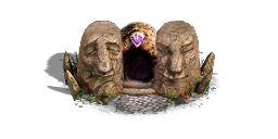
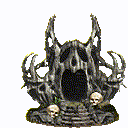
What about this adventure cave?
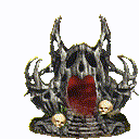
Or I can keep original animation, entrance dark, red eyes & glow
Hanna-Barbera style:
____________
Era II mods and utilities
|
|
artu
Promising
Undefeatable Hero
My BS sensor is tingling again
|
|
posted March 06, 2014 02:36 AM |
|
|
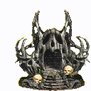
I think it would be much better if the last one with the flashing eyes wasn't over the top. How about this, try 2-3 pair of eyes most and definitely lose the ones right in the center.
Also, the skulls you added from the original doesn't fit in very well. Not ugly, but not necessarily suiting either.
|
|
bloodsucker
Legendary Hero
|
|
posted March 06, 2014 03:53 AM |
|
|
artu said:
Also, the skulls you added from the original doesn't fit in very well. Not ugly, but not necessarily suiting either.
Sorry but I couln't agree less, love the skulls. Nice touch.
|
|
fred79
Disgraceful
Undefeatable Hero
|
|
posted March 06, 2014 03:56 AM |
|
Edited by fred79 at 06:04, 06 Mar 2014.
|
Salamandre said:
this one is the best(and very cool, i might add), but like artu said, i would do without the middle set of eyes, and take a few others out as well, at random. that's some cool animation though, sal. the hanna-barbera reference is funny, i forgot that animation's in the intro to scooby-doo. 
(oh yeah, forgot about the skulls. they need tapered, the craniums are too big. they also need their saturation decreased, so that they would not stick out like sore thumbs, but blend better. i would increase the contrast a smidge, too. but remember that when you increase contrast, you're also increasing saturation, so whatever increase you make, you need to decrease that same amount, in saturation.)
sorry it took so long for me to get back to you. i'm sick, been up all night, and succumbed to sleep not long after i last posted.
i started back on the space animation after getting up and cooking dinner. i just finished with the animation, it's 96 ****ing frames for space to cycle correctly. i fell asleep about to smash my computer, because the mouse was making the animation layer jump around, instead of staying on track.
upon waking, i realized that i needed a size for the space layer that matched the height of the original frame, so it could much easily run "on track". that, and the pleasant discovery that i could use the arrow keys to move a frame while in photoshop, led to me not destroying my computer in frustration(being sick makes me much more hostile than usual).
blah blah, once i find the right stone layer to add, then manually add the shadows, then combine those into a layer that i can add to the 96 animation frames, i'll have a useable gif/def to post, for the summoning stones.
|
|
fred79
Disgraceful
Undefeatable Hero
|
|
posted March 06, 2014 05:59 AM |
|
Edited by fred79 at 06:10, 06 Mar 2014.
|
ok, i had to work a lot on the stone, i tried using darker textures(because they looked good), but they don't stand out enough. so i used the best-looking darkened one out of 6 different possibilites, then i tailored the **** out of that, to get the right shadows, lights, contrast, etc. i had to reshadow and relighten only certain areas twice. i've had to add color, as the grey blended too much with the background; but just a hint of color.
this is my first go at a finished frame. opinions? keep in mind, the summoning space in the middle will be fully and flawlessly animated, just not until i get feedback on the first frame(paired side-by-side with the old for comparison).
 
i could add some more erratic shadow around the summoning space, like the way certain sun graphics look, if you guys think it would be an improvement. i'm not too keen on the clean edges there.
i could also go with differently-shaped stones, as they do mirror some other graphics already.
|
|
Salamandre
Admirable
Omnipresent Hero
Wog refugee
|
|
posted March 06, 2014 10:29 AM |
|
|
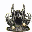
You cheat with the nice terrains around.
Show clean terrain or gif without shadows, hard to see the middle right now.
Reworked the skulls, removed frame with red glow, changed animation order.
Gif goes too fast. I resize the death chamber then re-upload what's ready on front page.
____________
Era II mods and utilities
|
|
fred79
Disgraceful
Undefeatable Hero
|
|
posted March 06, 2014 10:58 AM |
|
Edited by fred79 at 11:00, 06 Mar 2014.
|
i was trying to find an open space on a pre-existing map, as i don't like to have set up a new map for showing objects every single time. i try to be efficient.

you won't be able to get a good look at the space in the middle, until it's animated. i was waiting for feedback now, before i continued with 96 frames. because once that's done, i ain't doin' it again.
|
|
Salamandre
Admirable
Omnipresent Hero
Wog refugee
|
|
posted March 06, 2014 11:00 AM |
|
|
I would raise the middle and levitate it, especially if you have animation. 96 animation frames for that 3 pixel thing seems greatly exaggerated. 10-15 would do the job.
____________
Era II mods and utilities
|
|
fred79
Disgraceful
Undefeatable Hero
|
|
posted March 06, 2014 11:05 AM |
|
Edited by fred79 at 11:08, 06 Mar 2014.
|
problem with that is, i already did the 96 animation frames with the space where it is. that's a lot of work, just to raise the graphic a bit. i put it on the ground, because there is no base. but, i guess i could add a base, kind of like a platform for the space to sit on? i probably should've just did the one frame, and worried about animation later, huh? hindsight's a mother****er.
it's not exaggerated, it's how many frames it takes, for the space layer to cycle, from right to left, horizontally. like, moving through space. that's the only way my idea would look good.
____________
|
|
artu
Promising
Undefeatable Hero
My BS sensor is tingling again
|
|
posted March 06, 2014 11:13 AM |
|
|
|
I think, although it may use some work, the brightness still looks more portal like than the black hole. Or maybe it's because we dont see the animation.
|
|
|
|

 This thread is pages long:

