|
|
yogi


Promising
Famous Hero
of picnics
|
 posted June 29, 2015 08:52 PM
 |
|
Edited by yogi at 20:54, 29 Jun 2015.
|
|
Kimarous

Supreme Hero
|
|
posted June 29, 2015 09:02 PM |
|
|
For all the fuss some people made about allegedly being able to walk around the walls of the Academy and Necropolis towns, I'm honestly surprised there hasn't been a huge uproar over how one can walk straight though the gaps of the Sylvan gate... 
|
|
Gryphs

Supreme Hero
The Clever Title
|
|
posted June 29, 2015 09:07 PM |
|
|
Probably because there is no bridge to get there in the first place.
____________
"Don't resist the force. Redirect it. Water over rock."-blizzardboy
|
|
Kimarous
Supreme Hero
|
|
posted June 29, 2015 09:27 PM |
|
|
Of course they don't need a bridge...
https://www.youtube.com/watch?v=FnOSiATDY-g
|
|
Nocturnal

Promising
Supreme Hero
|
|
posted June 30, 2015 12:26 AM |
|
|
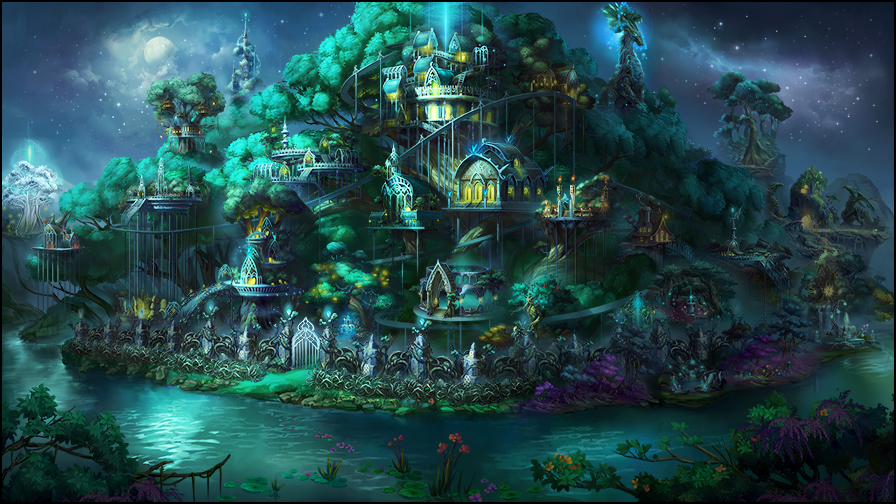
The Sylvan townscreen is just gorgeous. There will be times when I'll just enter my town and appriciate its beauty while listening to the town music.
____________
|
|
Alex_Yakub
Famous Hero
|
|
posted June 30, 2015 09:20 AM |
|
|
I love the Sylvan townscreen, it is very atmospheric and beautiful. No matter what anyone says, I think Limbic is doing great with townscreens in general 
|
|
Alex_Yakub
Famous Hero
|
|
posted June 30, 2015 09:20 AM |
|
|
Damn, stupid lagging internet, thanks fo making me doublepost 
|
|
Macron1

Supreme Hero
|
|
posted June 30, 2015 09:29 AM |
|
|
|
Sylvan townscreen reminds me Grove somehow. There is violet color also.
|
|
ChrisD1

Supreme Hero
|
|
posted June 30, 2015 09:38 AM |
|
|
Alex_Yakub said:
I love the Sylvan townscreen, it is very atmospheric and beautiful. No matter what anyone says, I think Limbic is doing great with townscreens in general
They do a great job indeed,given the almost zero support from ubi!
____________
|
|
kiryu133

Responsible
Legendary Hero
Highly illogical
|
|
posted June 30, 2015 04:07 PM |
bonus applied by Elvin on 30 Jun 2015. |
Edited by kiryu133 at 19:35, 30 Jun 2015.
|
since the discussion thread is pretty much on fire right now with people flaming people for weird reasons i've decided to analyze why H3 does a much better job with presenting their towns then h7 does. buckle up.
Let's start with the current hot-topic, Rampart/sylvan.
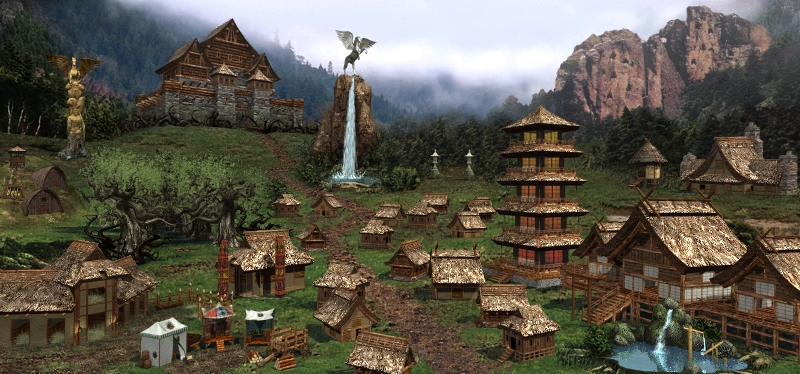
this is H3 rampart. How is this picture composed and why do people find it one of the better town screens? well, look at the composition of the picture. first of all, colours. what colours are there and how are they used? it isn't a rainbow or explosion of different colours, but rather it's a collection of earthy browns and greens with some earthy gold and white thrown in. Colours chosen are harmonious with each other, they work together and they don't clash. With subdued browns and greens, there are no strong reds or blues to distract the eye and attention is guided through lighting and objects instead.
there is also the placement and shape of buildings and terrain that helps in making the screen memorable. There are six zones*: left and right fore- mid and backgrounds separated by the pegasus dwelling between left/right and mage guild/tavern for fore/midground and grail/homestead for mid/background. This means every building can be put in any of these zones and navigating becomes easier. Centaurs? left foreground. castle? Left background. Unicorns? right background.
*can be made into 9 zones if you add a central column between pegasus and mage-guild
Where buildings are situated on this grid also impacts what they look like with small, unassuming dwellings and buildings being put in front or in the middle and large, noticeable (literal) mountains being put in the background where their size won't get in the way since they're further away yet retain a large and imposing feel. For example, the dragon dwelling is a huge building, massive even but doesn't take up much space at all since it's in the background. It's still huge and has some impressive presence despite being the same size as the stables. Speaking of the stables, it was put in the front making it larger than it otherwise would be, allowing us to see it notice it easily despite being a rather small and unassuming building and this is fine. We know it's not a huge building while we know the cliffs are massive due to the different locations in relation to the viewer.
The heroes 7 sylvan does none of that.
This is not an ugly picture, quite the contrary it's rather pretty. However it's also a giant mess. First of all, what is the primary colours used here? It's teal and while there isn't any strong red, there is plenty of vibrant yellows that distracts the eye, making the picture hard to really focus on. The yellows are too strong and bright with relation to the rest of the rather dark and subdued hues of the screen. The eyes can't focus on one thing at a time but are constantly moving around the different splats of yellow and bright, glowing teal around. There is also no real effort put into guiding the eye through lighting since the brightest part is the moon away from where you should want the player to look.
Building placement is even more of a giant mess. Remember how H3 had the town divided up in different zones? H7 has all the towns in one, big pile with no real dividing. Everything is in that big, teal lump in the middle. The buildings are also all rounded/oval in shape and take up just as much space with no regard for importance or impact of the buildings. in fact, the dragon dwelling is a small platform in the background with a shallow, glowing cave the size of the hunting lodge, taking distance in mind. can you guess where you get treants? It's not the big, white tree to the left, it's the big, normal tree to the right that's a bit behind the rest of the stuff. Foreground doesn't fare much better since there pretty much isn't one, it's all in thhe background meaning every building looks small and unassuming, not helped by every building being designed small and unassuming in the first place.
it's a dysfunctional, pretty mess.
I'd like to bring forth the best (factually i might add) town screen in the franchise: H3 stronghold:
Bright browns and beiges, clear foreground with smaller, unassuming buildings, background with grand, architectural achievements and use of lighting and shapes to lead the eye to dwellings and buildings without being distracting.
Compare it to the H7 stronghold and try to see what that one gets wrong
if only the pics could stay the right size...
____________
It is with a heavy heart that I must announce that the cis are at it again.
|
|
Macron1
Supreme Hero
|
|
posted June 30, 2015 04:17 PM |
|
|
kiryu133 said:
Building placement is even more of a giant mess.
There are much more dwellings in HMM7 than towns have in HMM3. So they have no chance to be visually distinguished, cause they are small (they all must be on screen in one time):-)
|
|
Avonu

Responsible
Supreme Hero
Embracing light and darkness
|
|
posted June 30, 2015 04:20 PM |
|
Edited by Avonu at 16:20, 30 Jun 2015.
|
@kiryu133
____________
"When someone desires information, they come to me."
"Details are everything."
Pipiru piru piru pipiru pi!
|
|
kiryu133
Responsible
Legendary Hero
Highly illogical
|
|
posted June 30, 2015 04:26 PM |
|
|
that is so relaxing... 
@macron1
That's a pretty bad excuse. especially considering the most eye-catching building for sylvan is the tavern.
____________
It is with a heavy heart that I must announce that the cis are at it again.
|
|
Maurice


Hero of Order
Part of the furniture
|
|
posted June 30, 2015 05:05 PM |
|
|
Macron1 said:
kiryu133 said:
Building placement is even more of a giant mess.
There are much more dwellings in HMM7 than towns have in HMM3. So they have no chance to be visually distinguished, cause they are small (they all must be on screen in one time):-)
Much is an exaggeration. Counting that screenshot shows 35 buildings in Rampart. In the H7 demo, we could see that Haven has 41 buildings and Academy has 40 (or the other way around). That's less than half a dozen more, on that total. Keep in mind that the H3 townscreens had to fit in a much smaller resolution than the H7 towns ever have to be.
|
|
alcibiades

Honorable
Undefeatable Hero
of Gold Dragons
|
|
posted June 30, 2015 05:11 PM |
|
|
Kiryu, again, an excellent analysis. The issues of uninformative building designs and messy picture composition is definitely a prime issue with these screens. I would like to add that there actually isa foreground in the new townscreens - but it's always occupied by the town wall, which not only pushes everything into the backgrond like you say, but also gives you the feeling of being locked outside the town, hence killing immersion. Notice how in H3 on the other hand, buildings literally continue out the sides in the front of the picture, placing you in the town.
I agree that while H3 Stronghold wasn't my favorite townscreen (pretty far down my list in fact), it's a prime example of everything that was good about H3 townscreens.
PS: It just strikes me: Since I haven't bothered to check the explanation labels on the H7 Sylvan townscreen: I can't even guess which building is the mage guild. I mean, I look around the entire screen, and I'm completely blank which one it can be. That ought to be the easiest building to recognize simply because of the level structure, no?
____________
What will happen now?
|
|
Storm-Giant

Responsible
Undefeatable Hero
On the Other Side!
|
|
posted June 30, 2015 05:13 PM |
|
|
Another important aspect is space usage. In H3 resource silos and creature growth buildings were a small addition to the main building, in H7 at the very least the silo is a complete new building. For instance, in Sylvan TS the silo is bigger than the marketplace lmao
____________
|
|
kiryu133
Responsible
Legendary Hero
Highly illogical
|
|
posted June 30, 2015 06:12 PM |
|
Edited by kiryu133 at 18:13, 30 Jun 2015.
|
There is also a point to be made about what the original artwork is made as: the completed town or the unbuilt town. I do not know which one is the case in h7 (though i can guess it's fully built judging by them only showing them) but in h6, only a fully built town looked even remotely good. It was originally made complete which caused issues with certain buildings like sanctuary coral maiden dwelling gettin cut-off in places if you hadn't built castle. In h3, an unbuilt town shows a landscape beautiful in its own right with valleys, fields, mountains etc, no area necessarily made for any specific buildings. the stronghold mountain isn't there just to become a behemoth cave, the behemoth cave is there because it's a mountain. Not the case in h6 and it seems h7 where every terrain feature seems specifically made for X building. They don't develop naturally, just sort of gets blown out like a bounce-house.
alcibiades said:
I can't even guess which building is the mage guild. I mean, I look around the entire screen, and I'm completely blank which one it can be. That ought to be the easiest building to recognize simply because of the level structure, no?
i believe it is just left of the entrance and completely un-tiered.
Storm-Giant said:
Another important aspect is space usage. In H3 resource silos and creature growth buildings were a small addition to the main building, in H7 at the very least the silo is a complete new building. For instance, in Sylvan TS the silo is bigger than the marketplace lmao
another large issue. buildings that add to or are part/upgrades of existing buildings, get an entire own building away from the original one. this very prevalent in academy where, in h3, the resource silo is a tall clock tower added on top of the marketplace while in heroes 7 resource silo gets it's own damn floating island on the opposite part of town. Can't say that helps fix the clutter...
____________
It is with a heavy heart that I must announce that the cis are at it again.
|
|
Steyn

Supreme Hero
|
|
posted June 30, 2015 07:28 PM |
|
|
I actually managed to pick out the magic guild, but then again I already knew what certain buildings, such as the capital and hunters lodge, were. It is indeed not very clear, but in haven and academy TS the mage guild is done better.
I like that in the academy TS the buildings that increase growth for cabir and gargoyles are located at the cabir dwelling. Unfortunately they didn't do this for (all) other buildings. The growth building for guardians/justicars is even bigger than the dwelling itself 
____________
Can you make a faction including these units?
Join the Finding Harmony competition 2.0!
|
|
icefield

Adventuring Hero
|
|
posted June 30, 2015 07:55 PM |
|
|
Adding to kiryu's excellent analysis:
The H3 townscreens (most of them) have a clear geometric structure that involves small and large buildings, foreground and background in an arrangement that draws the eye to the center. They are composed as the inside of a room. They follow simple principles that make them immediately interesting to the eye.
The H7 townscreens, Sylvan in particular, are reminiscent of the H5 townscreens - you are looking at the outside of some object. In contrast to H5 where there was the camera flying around the object, this is 2D, and rather shallow - nothing is really near or far, and nothing is really big or small.
So, even if they are pretty as artwork, they don't look as eye-catching as the H3 screens did. This might actually be intended by the artist, (s)he doesn't have to follow those simple principles. But the audience will be less impressed on first sight.
It's intriguing to look at the H3 dungeon townscreen. This actually is the inside of a room (the cave), but it lacks foreground and background. It doesn't appeal to me as much as some other H3 screens do.
|
|
kiryu133
Responsible
Legendary Hero
Highly illogical
|
|
posted June 30, 2015 08:24 PM |
|
|
It does some other cool things though, like playing around more with colours: it's the most colour-diverse screen in h3 which it can be due to the primary colour being a very dark gray.
and it does have a foreground with eyes, mushrooms and marketplace etc. But it's not as prevalent/obvious as other screens.
|
|
|
|


 This thread is pages long:

