| Proposition for New HC Design |  This thread is pages long: 1 2 · «PREV This thread is pages long: 1 2 · «PREV |
|
Lord_Woock


Honorable
Undefeatable Hero
Daddy Cool with a $90 smile
|
 posted May 02, 2006 09:58 PM
 |
|
|
Perhaps a little better, but I think it still looks like you crammed in as many fonts as you could just for the sake of variety.
Keep trying, you'll hit the spot sooner or later.
|
|
Shadowcaster

Honorable
Supreme Hero
Shaded Scribe
|
|
posted May 02, 2006 10:16 PM |
|
|
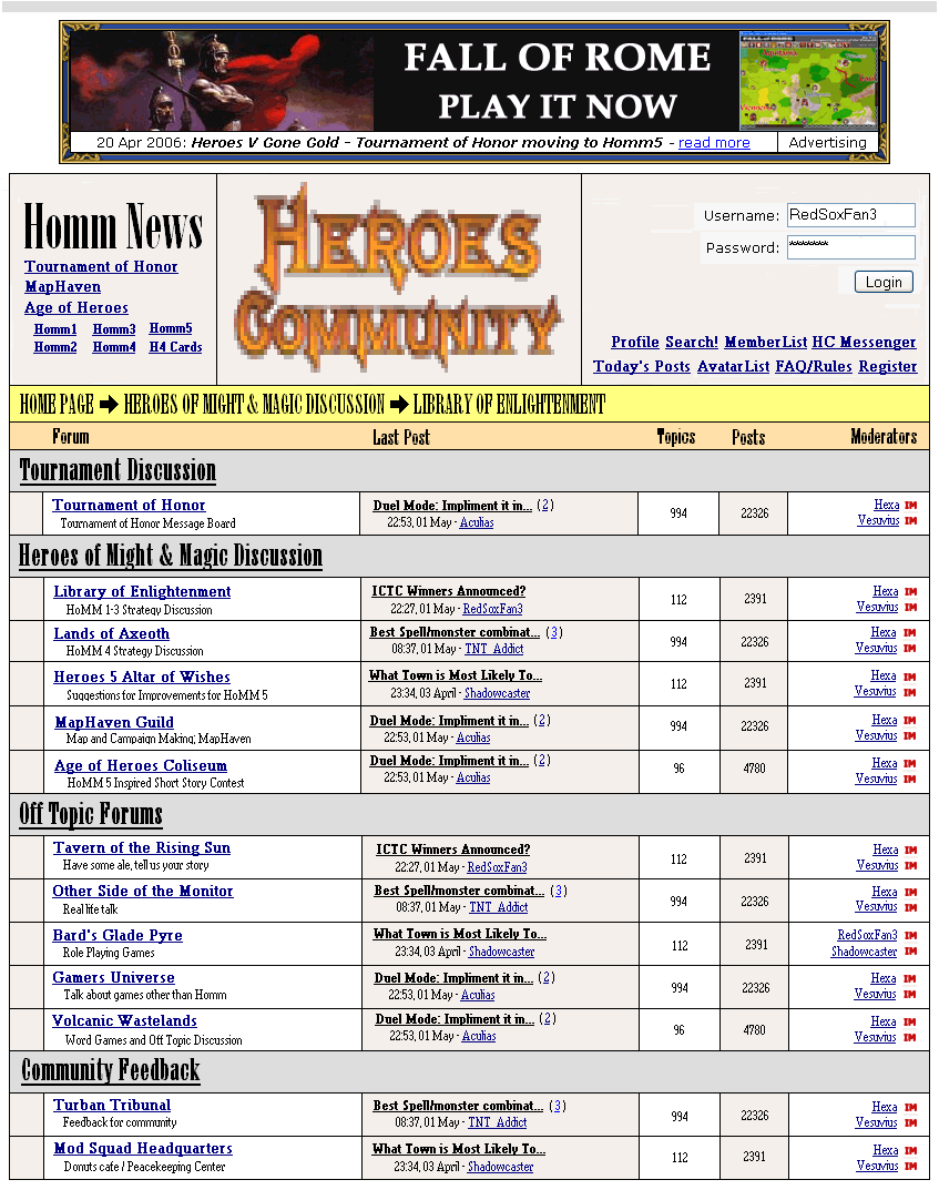
A couple things I noticed...
The header size is gigantic. I don't know what you're trying to do there, but, if it doesn't undermine your overall design view, I'd definitely tone them down for the next version.
Also, the yellow bar really sticks out. Have you tried going a shade in between the HC logo above it and the bar below it and then adding a white shading to your text if necessary?
Other than that, just sharpen up a few things like the placement of links at the top and the logo, which has quite obviously been expanded.
____________
>_>
|
|
RedSoxFan3

Admirable
Legendary Hero
Fan of Red Sox
|
|
posted May 03, 2006 12:55 AM |
|
|
Quote:
Perhaps a little better, but I think it still looks like you crammed in as many fonts as you could just for the sake of variety.
Keep trying, you'll hit the spot sooner or later.
That's only two fonts Woock. And I'm not trying to cram as many fonts into one space as possible.
All of the headers are the same font. All of the links and body text are one font. The difference is font size, underline and bold.
I'm gonna give up now and just give a quick synopsis of what I've learned.
The basic concept behind Visual Design is that the way you set up the page, there are visual queues as to what information is the most important.
Large Bold Fonts will stand out and be seen by the eye well before something written in small non-bold font.
Understanding this basic concept there are 4 basic rules.
Contrast, Repetition, Alignment, and Proximity
Contrast is exactly what it means. A page with good contrast in colors, font style, font size, will make the page more easily distinguishable. The idea in visual design is that when you look at a page of text, you will look at what stands out on the page first.
The reason I have the headers so big is that they stand out instantly and anyone who has never been to HC, will instantly know that everything under that header is related to that header. All the forums beneath Heroes of Might & Magic Discussion are related to Homm discussion.
If you look at the homepage now, you probably wouldn't even notice these forum categories. You can barely see them because the gray background takes away all the contrast from the header. The width of the subcategory headers are also a lot smaller than one of a just a single forum. The effect that you get is that the forums in a visual sense become more important to the eye, then the subcategories do. I personally felt this was one of the main flaws in the current design.
Now I'm going to explain another concept, so I can finish explaining why that is such a problem.
The next concept I'm going to explain is proximity. Basically you want to group all related information together in one small area. The best example of this is my box for Homm News in the upper left. Someone who has never been to this website would be able to guess that somehow, Homm1, Homm2, Homm3, Homm4, Homm5, and H4 Cards is related to Age of Heroes. This is because these links sit directly underneath Age of Heroes, have a smaller font and are arranged into 3 columns. People who have never been to the website will instantly be able to see that.
I feel that this setup for links is a lot more functional, and the Homm News banner groups all of those links together perfectly. So back to the issue about proximity. The large headers are grouping things together. The high contrast makes it stand out that much more over the things inside of it.
If I made things really low contrast, these visual queues would be too subtle and the eye would start to wander. However perhaps the reason this design isn't working is because everyone is used to seeing things a certain way and this change in information Heirarchies is disrupting the logical flow of the website if you compared it to what it is currently.
Overall I think that new members will have a much easier time navigating HC with a design like mine. My lack of experience at this is the reason I'm still an ameteur or novice. A professional would likely do a better job at this.
So when I started out to attempt to improve the design of HC, I started by using more stylized fonts.
Honestly no font was random or arbitrary. Everything was chosen for a reason.
I can try toning down the headers of the subcategories a bit and see what you think.
As for the yellow, you wouldn't believe how soft the yellow is already. That's what warm colors do. They can very easily create a LOT of contrast.
____________
Go Red Sox!
|
|
supersonic

Famous Hero
being digested. E=mc^2, s=vt
|
|
posted May 03, 2006 06:16 PM |
|
|
Well, all that looks nice to the eye. Heroes Community shouldn't have flashy colors so that everytime you enter it you have to clean your eyes.
The colors you did are good. I like all those white. The use of beige is very good. I would change yellow into very light grey, but it is still marvelous job. Black letters look good on those whitish themes, so you have also achieved an ergonomic effect.  . For the use of colors I'd say very good. . For the use of colors I'd say very good.
Fonts are also nice. It is good that you haven't tried to make them all different colours, because then I would have to buy a Braille Keyboard. It is good for the eyes, so that you could spend a lot of time browsing through HC without a pain in them. Types of font are also nice. They are readable, not some sort of runes, or something. I like that.
Well, I assume you have pasted the logo, but with you talents you could make a new and original one.
To the rest: if you think his job is bad, present something better, so that we will know that you are not just criticising everyone around. 
____________
I am having a new style
Big, fat, naughty. Potential girlfriend - pm me. 
|
|
RedSoxFan3
Admirable
Legendary Hero
Fan of Red Sox
|
|
posted May 04, 2006 03:14 AM |
|
|
Shadowcaster said make the headers a bit smaller and I thought he might be right.
So here's the same thing but with smaller headings.
____________
Go Red Sox!
|
|
Loknar

Adventuring Hero
Missing Links
|
|
posted May 04, 2006 03:17 AM |
|
Edited by Loknar at 03:25, 04 May 2006.
|
RSF
Quote:
If you look at the homepage now, you probably wouldn't even notice these forum categories. You can barely see them because the gray background takes away all the contrast from the header. The width of the subcategory headers are also a lot smaller than one of a just a single forum. The effect that you get is that the forums in a visual sense become more important to the eye, then the subcategories do. I personally felt this was one of the main flaws in the current design.
andQuote:
Overall I think that new members will have a much easier time navigating HC with a design like mine.
seem to indicate that your primary concern is to optimize the HP for new users. I think we agree that rule no. 1 for HP design is that it has to be functional. But in reality, implementing one function means excluding others, so you must weigh the functions it should have. I perceive the current HC design as very functional for the uses of an accustomed HC user. The highlighting of the forum hierarchy is marginal to him/her; he/she looks for Turban Tribunal rather than for Community Boards. You cannot highlight something without setting something else to the background, and if you highlight all, you have highlighted nothing. So, you can only highlight either Turban Tribunal or Community Boards, or speaking in functions: You cannot optimize the board (in all respects) for the uses of all users, but must weigh if the novices or the addicted should be more important. I'd say the latter. Moreover, the functions in which your design outranks the current imo are mainly to grab attention and to reflect the informational hierarchy, thereby allowing a fast orientation. Both functions correspond to the uses of an accidental popper-by who should be brought in. This reminds me of classical lore of free-market selling, and frankly, I appreciate HC not to.
Fonts, colors, sizes… these are really wide fields, because they are always subject to tastes (which in turn mirror sexuality, they say ), but there is some functional constraint even here. If you have ever turned a classical Hollywood movie DVD and tried to find out who that actress might be, you will perhaps have experienced the frustration of knowing it is written there, but you cannot read it. (My sight is over 100%, btw.) I guess wherever space is valuable, there is that cramming temptation. Long speech short: I'd never use condensed on a HP. And I especially don't think such an extremely accented classicist font is optimal functionally. (I don't like handwriting fonts, either, but that surely belongs to the realm of sexuality.  ) - And from my (Mac) point of view, vertical screen real estate is more valuable than horizontal one because scrolling is a nuisance. ) - And from my (Mac) point of view, vertical screen real estate is more valuable than horizontal one because scrolling is a nuisance.
Apart from this, I agree with many principles you state, and some of your alterations would be improvements imo. Like, looking at contrast, I agree the black on dark green writing is not optimal. However on the whole, I perceive the "plainness" of the HC HP design as a quality. It has a touch of unpretentiousness that strikes me as friendly.
|
|
RedSoxFan3
Admirable
Legendary Hero
Fan of Red Sox
|
|
posted May 04, 2006 03:33 AM |
|
|
Well I was talking to Val about this and apparently when using WWW websites, regular IE packages and such only come with a few basic fonts, so using obscure fonts will actually not make the page load properly for those who don't have that particular font.
These are the four fonts that you can use at HC currently.
Heroes Community
Heroes Community
Heroes Community
Heroes Community
You can also use Arial and another one. Can't remember which.
____________
Go Red Sox!
|
|
RedSoxFan3
Admirable
Legendary Hero
Fan of Red Sox
|
|
posted May 04, 2006 04:04 AM |
|
|
Someone said that I should make a logo, so I whipped this up really quick.
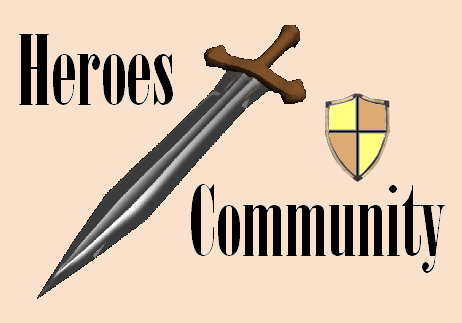
I pulled the sword off google images and I pulled the shield from my avatar. I don't really like how the shield looks. I'd need to get something better for that.
____________
Go Red Sox!
|
|
LordTitan

Famous Hero
Hit Dice: 76d12+608 HP
|
|
posted May 04, 2006 04:06 AM |
|
|
this place has been updated since I was here last...
When I read 'New HC Design', I assumed that the new design would be.. more different. It appears I assumed wrong.
In my opinion, a re-designed web page should atleast have new colors or borders, it looks to me like it is simply different fonts and font sizes, no offense.
Hints:
// Serif fonts are ugly on larger scales, even more ugly when bold.
// Large fonts are not required, used only when making a point.
// Bland colors (such as grey, grey and yellow) do not go well with bland colors (such as grey, grey, and yellow), use colors that go well with each other, such as white and blue, or Black and Silver.
// It's the little things that count, a well decorated border may not be noticed first glance but it adds atmosphere, for example the borders for your alignment in H2.
You can take these suggestions if you want, or you can take offense to them, either way I'm not on HC very often so it doesn't matter to me, nice logo for a quick one though.
later, yo.
____________
Spaek the Titan
|
|
RedSoxFan3
Admirable
Legendary Hero
Fan of Red Sox
|
|
posted May 04, 2006 04:45 AM |
|
|
To be perfectly honest If HC looked the way it does in my second thing, and I proposed it the way it is now, there would still be people picking it apart.
Someone earlier said that there were dots below one of my links in my first example. Well take a look at the links at HC now. Register, Today's Posts, Search!, etc.
Hey those have dots under them too. Wow what a coincidence. I copy pasted something from this website, cause I didn't have the time to redo everything, and people criticize somethat that is in the current design here at HC.
In response to Titan:
Bold serif fonts are not ugly on larger scales. My logo has a large bold serif font, you seemed to like that.
Anyway another thing about serif fonts are great for reading bulk texts, because they help you read.
You can believe me on this or not. But the serifs actually make it easier to read that small font that you see at the bottom of your signature post. Granted New Courier might just be the ugliest font in the world, but it's easy to read, because of the serifs.
That's why I chose to make the smaller fonts serif.
The impression I get is that the bulk of people like to see sans serif fonts for their headers.
Edit: Here's a good example I'm gonna use the georgia font and copy Lord Titan's post and post it here but in georgia font.
Hints:
// Serif fonts are ugly on larger scales, even more ugly when bold.
// Large fonts are not required, used only when making a point.
// Bland colors (such as grey, grey and yellow) do not go well with bland colors (such as grey, grey, and yellow), use colors that go well with each other, such as white and blue, or Black and Silver.
// It's the little things that count, a well decorated border may not be noticed first glance but it adds atmosphere, for example the borders for your alignment in H2.
The reason that is easier to read is because the serifs help the eye find the next line quicker. People have done countless studies on this.
I'm gonna try a different design to see what else might work.
____________
Go Red Sox!
|
|
supersonic
Famous Hero
being digested. E=mc^2, s=vt
|
|
posted May 04, 2006 08:55 PM |
|
|
Excellent, IMO
____________
I am having a new style
Big, fat, naughty. Potential girlfriend - pm me.
|
| |
|
|


