|
| Thread: Homm Visual Aspects |  This thread is pages long: 1 2 3 4 5 · «PREV / NEXT» This thread is pages long: 1 2 3 4 5 · «PREV / NEXT» |
|
Elvin


Admirable
Omnipresent Hero
Endless Revival
|
 posted August 10, 2015 06:22 AM
 |
|
|
I don't like the idea of a 3D map editor anyway. I'd like it to be 2D like in the old games with optional 3D to tweak eyecandy and facing directions when you're done with the rest.
____________
H5 is still alive and kicking, join us in the Duel Map discord server!
Map also hosted on Moddb
|
|
Maurice


Hero of Order
Part of the furniture
|
|
posted August 10, 2015 11:53 AM |
|
Edited by Maurice at 12:06, 10 Aug 2015.
|
I'll toss in my 2 copper pieces in the Fountain of Fortune.
Elvin said:
ART
Much as I agree that Ashan should seek and maintain its own visual style, I find some problems with its current implementations. Much of its art is stunning except..
On the aspect of copying units over with only very minor, marginal changes: I don't mind. If a unit is designed well enough, it will look good in other titles of the series as well and can actually form a sort of cohesion between them. On the other hand, it is also a marker for a static, stagnant world, where units (and concepts and ideas) don't age - at all.
However, I do fully agree with you on the overdesigned nature of the units. While I wouldn't mind some decorations on the Champions (and even some on the Elites), the Cores should be much more mundane. They're the rank and file, the grunts on the battlefield. Pragmatism and practical armor and weapons should be key. I do realise, however, that this is most likely an exaggerated expression of High Fantasy, which seems to be the chosen style for H6 & 7.
So I would say: agree.
Quote:
INTERFACE
Skills, stats, specialization, army, warmachines, paperdoll. It doesn't even waste room with backpack artifacts!
Add a button to show/hide the full skillwheel and you have everything you need.
I'm going to play the Devil's advocate here to some degree: H7 features a more extensive skill system than H3 (regardless of the form it has taken). It has to display more. The H3 interface leaves relatively little room for these extra components - unless indeed, as you suggest, you add an extra skill window. But isn't that almost exactly what H7 does?
As such, I am somewhat neutral about it: don't mind.
Quote:
Speaking of paperdolls, do we need the hero model in there? Doesn't the classic paper doll look so much better?
Either works, really. They should make the empty artifact boxes translucent and show the Hero in a certain pose, with the artifact boxes in the proper places. So old distribution, new looks.
Again: don't mind, but leaning towards agree.
Quote:
2) Take hiring screen. H3 shows all units - animations included - with stats, specials and availability. Even their dwellings.
No disagreement here, so highly agree.
Quote:
3) Adventure map UI. The interface is beautifully intergrated in the screen. Minimap, towns, heroes and other functions all grouped together on the right. There is a structured approach, not hero portraits or towns glued over the edge of the adventure map. This kind if UI is invasive and shows less info! It doesn't have the aesthetics or cohesion of the old games.
Disagree but not for the reasons you may think; it just needs to be implemented somewhat differently. By segmenting the UI as UbiSoft has done, the adventure map is no longer captured within a frame of its own, but rather freed up unto the entire reach of your monitor. It actually shows more of the adventure map, even if some of that "more" is hidden behind interface windows.
The concept of allowing the player to hide the various interface panes is actually a great one. One major change they should make, hoever, is to place the various UI elements along the border of the screen. Even better would be to allow the player to customize the location (and size) of those elements; in theory, setting it up according to what it looked like in Heroes3 should be allowed by such a liberty as well.
So, in the end, I agree that they need to change it, but I disagree about the form.
Quote:
ADVENTURE MAP REPRESENTATION
Back in the day, the adventure map looked like an actual map. Everything had a symbolic size, like a location marked on a map.
Everything visible. Not much room required to place all locations of importance. Allows for a good overview of what there is to visit. Recent games changed the location scale to realistic which led many people to feel that the maps were emptier. I am happy that H7 is closer in scale to the old games.
Still, I feel they could do better, yet. Take a look at a recent game, Age of Wonders 3, which combined the 3D aspect with a symbolic approach of the adventure map, as well as not oversaturating the window with UI elements:
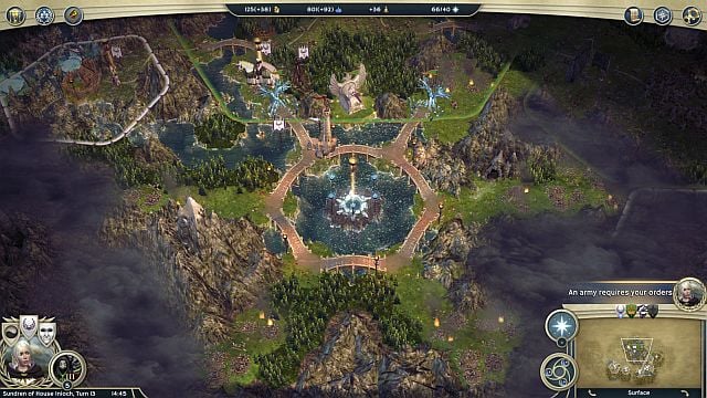
The game looks really beautiful, no gameplay elements (items, units, etc ...) are obscured from view. As an added bonus, when you zoom out, the map eventually turns into a parchment map, which hides a number of elements that you don't want to see on such a birdseye view anyway:
So, I highly agree.
Quote:
BATTLEFIELD REPRESENTATION
H3 battlefield was close to the armies, where every unit could be seen in detail. But more importantly it was practical: The whole battlefield would fit within the screen without requiring a zoom in or zoom out. Without sacrifing unit detail.
In Heroes7, you do not feel like you are in the battlefield. The units look tiny by comparison. All that room around the battlefield is wasted on eyecandy.
This is also an aspect that Age of Wonders got right: it had a free-floating camera. But then again, it also had a rather large battlefield size as well as hexagons  . .
Personally, I think they need to reconsider the shape and form of the battlefield as a whole. The GUI and camera are integrated in that redefinition, if you ask me. So, agree.
Quote:
TOWN SCREENS
There's a whole topic dedicated to the Town Screens. I am not going to rehash my posts from there here; all I can say is that they need to change - drastically. Can't say anything else but highly agree.
|
|
Stevie

Responsible
Undefeatable Hero
|
|
posted August 10, 2015 04:46 PM |
|
|
Highly agree on every account. And I also think it is very hard to realistically expect change in the right direction, especially in the Art department, all the rest having various degrees of improbability. Personally, I think that a pleasing visual style is beyond the abilities of the M&M team under the current vision / direction, responsibility for that lying chiefly with Erwan le Breton. It is sad to see that other games like AoW3 and King's Bounty appear to be more Heroes in feel than Heroes 7 itself.
____________
Guide to a Great Heroes Game
The Young Traveler
|
|
PandaTar

Responsible
Legendary Hero
Celestial Heavens Mascot
|
|
posted August 10, 2015 06:54 PM |
|
|
Elvin said:
2) It is so painfully overdone. So many symbols, decorations, chains, spikes, shiny effects.. How many actually like that? There should be a point where we draw the line for crying out loud. I am not asking to return to an H3 visual style (though I'd prefer the classic style to be honest) but would it be too much if they toned down all that invasive decoration? Even core units look dressed like popes.
This, and...
Quote:
BATTLEFIELD REPRESENTATION
You do not feel like you are in the battlefield. The units look tiny by comparison. All that room around the battlefield is wasted on eyecandy.
... this.
These are completely confronting ideas from their part while designing the game. They made all those details for those units so you couldn't see them. Unless you keep zooming in and out, which is pointless after, what, three battles?
____________
"Okay. Look. We both said a lot of things that you're going to regret. But I think we can put our differences behind us. For science. You monster."
GlaDOS – Portal 2
|
|
EnergyZ

Legendary Hero
President of MM Wiki
|
|
posted August 10, 2015 10:25 PM |
|
|
Now listen here and listen good. I am tired of seeing the same visual aspect; the key being those high-tech graphics. Who said that we needed the realistic graphics? I claim part of the charm of the Heroes games were the way they were drawn. These realistic graphics could serve first person shooters, or maybe some other genres. Heroes is not such a game. H5 does feel more vibrant in this, but the negative part is that 3D made it look more like a Warcraft game, sadly enough. Or that was my feeling when I first started playing that. Battle maps have evolved and have expanded. But as some people mentioned, it does not feel like a battlefield. I don't know why would it be that way. Well, maybe that H7 battle field when one besieges the Haven town...
Interface remained more or less the same, but could be improved, though. It got tons worse in H6; when recruiting creatures, it was not shown the 3D model of the creature. Even worse, H7 repeats that mistake. It is a part of the charm, makes you certain what are you buying. Which may also be important for any new fan playing Heroes games. The screen to show the heroes with artifacts and other things did take a step forward, but it wasn't a leap. Heroes IV had the artwork for by class and gender. Heroes VII does it as well, but it feels distant to place an artifact that links to the part of the body. On a side note, they could at least bring in belts, earrings and gloves as a separate artifacts.
So all in all, even if the world revolves around us and games change, some things are just meant to be the way they are and shouldn't be changed much. Of course, they can be revised, see how they can be improved, but not directly edited.
|
|
icefield

Adventuring Hero
|
|
posted August 10, 2015 11:07 PM |
|
Edited by icefield at 23:09, 10 Aug 2015.
|
Elvin said:
ART
Much as I agree that Ashan should seek and maintain its own visual style, I find some problems with its current implementations. Much of its art is stunning except..
1) It is not dynamic, the creative control will not allow units to look much different between games. In H6, duel of champions and might & Magic X units look pretty much the same. Even H7 seems unwilling to break from the mold unless the community enters a state of fanrage. Why? Much as there should be some standards, who the hell asked for such stagnation? The old games were not afraid to reinvent units, there was no fear we'd get a new heroes game where the units would be slight edits of the previous one. And this is not a matter of budget, even by reusing a model you can rework a unit's aesthetics to make it look vastly different. Hair, armour, weapon, colours, stance.. A fan modder could do it. Sure there are subfactions like jungle, steppe or desert orcs but should we move on to another archetype to see some change? And what about factions like necro that do not have clear subfactions? Tough luck, here's another H6 necro? No thanks.
Don't mind, because I didn't play H6. If H7 turns out to be a game that I like, I would expect any further installment to have new designs, however.
Quote:
2) It is so painfully overdone. So many symbols, decorations, chains, spikes, shiny effects.. How many actually like that? There should be a point where we draw the line for crying out loud. I am not asking to return to an H3 visual style (though I'd prefer the classic style to be honest) but would it be too much if they toned down all that invasive decoration? Even core units look dressed like popes.
Highly agree. It's not so much the textures but the careless mishmash of clothing parts and bling on the humans. The beast models have similar problems. Especially cores I'd prefer to have rather 'boring' visuals, (some) champions and high-level magic creatures might stick out.
Quote:
INTERFACE
I find it hard to believe that every homm game since ubi took over has a worse UI than H3. Every. Single. One.
1) Take the hero screen, H3 required only one screen to show everything.
Skills, stats, specialization, army, warmachines, paperdoll. It doesn't even waste room with backpack artifacts!
Add a button to show/hide the full skillwheel and you have everything you need.
Speaking of paperdolls, do we need the hero model in there? Doesn't the classic paper doll look so much better?
Agree, but: frankly, the sliders on the backpack slot in the H3 screen are already a nuisance, which can be fixed in higher res. Ideally, an interface should show everything without tabbing and scrolling, but with a clear structure and substructure that identifies each part on first sight. Suitable decoration in the frames give the immersion, that's it. The complexity of H5/7 requires more entries than the H3 screen, however, so it's not that simple.
Quote:
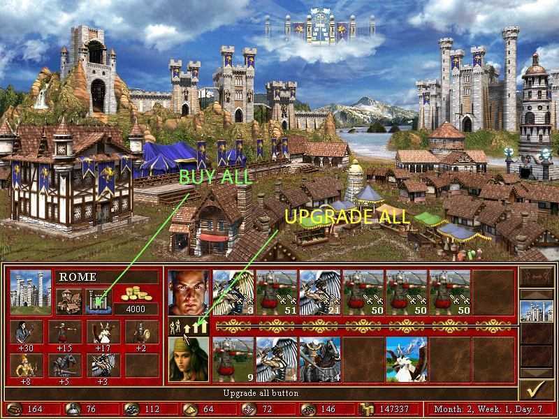
2) Take hiring screen. H3 shows all units - animations included - with stats, specials and availability. Even their dwellings.
All the information you could ever want from the units is there in one screen. H5 was a little bit worse. H6 devolved further. No overview for all units and I don't really care for the artwork. In H6 it wasn't even a separate, full screen..
Highly agree, why do anything different here than H3?
Quote:
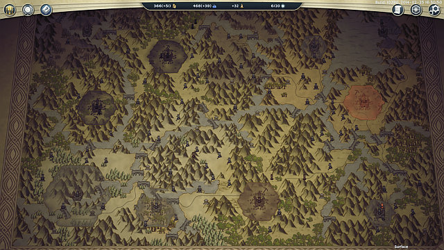
3) Adventure map UI. Look at this beauty:
Quote:
The interface is beautifully intergrated in the screen. Minimap, towns, heroes and other functions all grouped together on the right. There is a structured approach, not hero portraits or towns glued over the edge of the adventure map like here. Or here. This kind if UI is invasive and shows less info! It doesn't have the aesthetics or cohesion of the old games.
Agree, partially. The adventure map may be full screen or a window like H3, in any case the controls will take their part. The price for the completeness of controls in H3 was a smaller adventure map window. If they had done it like this many people would have complained because a 'full screen' adventure map gives more immersion - difficult issue.
Quote:
ADVENTURE MAP REPRESENTATION
Back in the day, the adventure map looked like an actual map. Everything had a symbolic size, like a location marked on a map.
Everything visible. Not much room required to place all locations of importance. Allows for a good overview of what there is to visit. Recent games changed the location scale to realistic which led many people to feel that the maps were emptier. I am happy that H7 is closer in scale to the old games.
Highly agree. I have to admit that the nice mod showed by salamandre above also has such a 'realistic' scale, I like the original H3 (and maybe H7) more.
Quote:
BATTLEFIELD REPRESENTATION
H3 battlefield was close to the armies, where every unit could be seen in detail. But more importantly it was practical: The whole battlefield would fit within the screen without requiring a zoom in or zoom out. Without sacrifing unit detail.
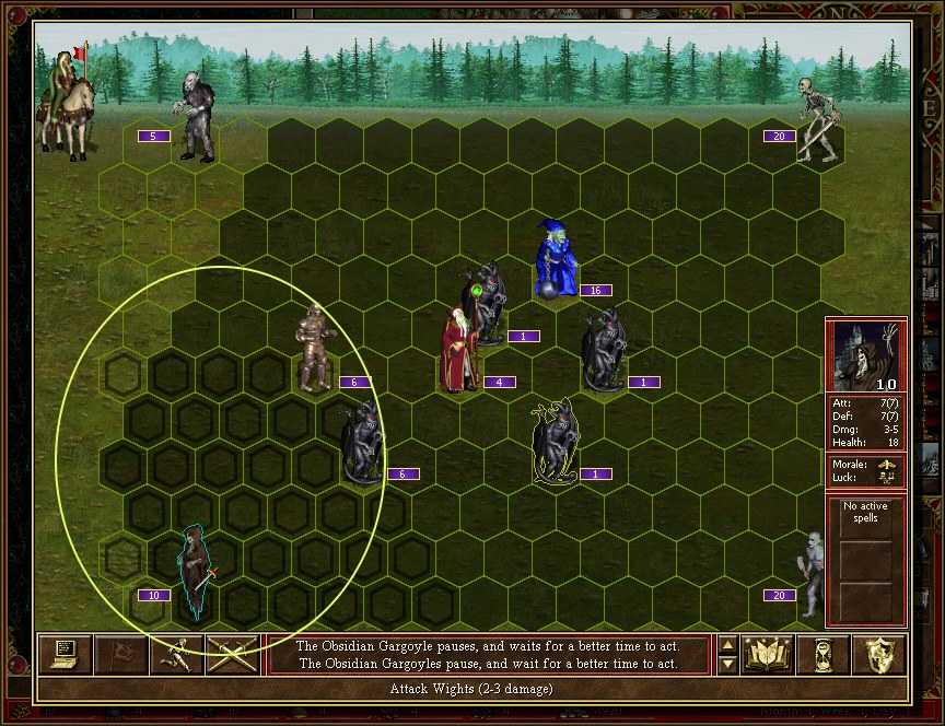
Compare it to this:
You do not feel like you are in the battlefield. The units look tiny by comparison. All that room around the battlefield is wasted on eyecandy. Which is why I recommended changing the default camera distance to this:
Another game I feel has a good combat camera is king's bounty. Here's an example. And another on a brighter battlefield.
You can zoom in or rotate the camera but the default distance is just fine. You don't need to tamper with it to appreciate the combat like with H6. I frequently zoomed in but then I could only see a part of the battlefield. And then any mouse movement could change that view which I found annoying.
Highly agree regarding the default zoom. The main culprit is, however, 3D. A H1/2/3 perspective is impossible for a correct projection of a 3D model. Either you see only the helmets from top-down, or the squares are distorted and the units obscure each other. It would be interesting if they tried a stronger distortion of the correct 3D projection which might look weird but put more emphasis on the units, approaching the 2D perspective.
Quote:
TOWN SCREENS
What I liked the most about H3 town screens was that every single building was clearly visible and easily identifiable.
It was subtly animated so as to give the feeling of life.
Champion dwellings were highlighted and you could tell they were special. (Dragon cliffs anyone?)
Not all dwellings were buildings, some were part of the natural environment like caves, cliffs or forests.
They had a variety of colours, used in a way to distinguish buildings one from the other.
There were numerous non-military houses that gave the impression of an actual town.
Buildings were set up in a logical way. There were no passability problems and dwellings were where they might be expected. Rocs at high ground, behemoths isolated. Tavern and marketplace were easily accessible. Only fortifications did not feel quite right but I can forgive them for that one 
Sanctuary
Stronghold.
Shades of Purple
In H6 it is not easy to distinguish buildings due to the colour palette. All dwellings look like more of the same. Champion dwellings do not stand out much. No citizen houses. No particular plan in building placement. It looks pretty but it's not very practical. Same is true for H7
This is not a problem of color palette, but it's the composition of the images. The H3 screens (and also H1,2) were arranged like a theater stage, the buildings are the furniture of a room. The spectator feels like being inside the town, regardless of buildings, color, etc. Since H5 (not speaking of H4), they switched to a circular arrangement (mountain, pillar) which you view from the outside. This was done for the H5 cinematic camera, and it is actually more realistic for a town, but is not a good idea for 2D screens. Some of the H7 towns are like H5 in this respect, some more flat, but if laid out in this way they can't give the immersion of the H3 screens.
I think if they designed theater-stage towns again, they would look much more appealing, regardless of the art style.
|
|
foxxxer

Promising
Famous Hero
|
|
posted August 10, 2015 11:28 PM |
|
Edited by foxxxer at 23:29, 10 Aug 2015.
|
ART
1 (Agree): Even though I don't mind re-used models in the related games (spin-offs) of the franchise, I'm totally against recycled models used in two games from a same series (H6 -> H7). It would be poor management of resources if they didn’t use the models in the spin-offs but when it comes to completely new installment from certain series, please. Many companies have started doing this practice and the people consider it as something common nowadays.
2 (Highly Agree): I’m so fed up of everything over the top. Also I dream for modest colors again.
INTERFACE
1. (Agree): Everything is ordered and visible. Even a whole skillwheel would fit as the resolutions are higher nowadays and the hero screen can be designed bigger.
2. (Highly Agree): Hiring screen similar to this is highly required (imo) especially considering the current tier system (3-3-1) as you can see the stats. Imagine the scenario where you expect another hero to besiege your town and you don’t have enough money to buy all creatures. This screen is very practical (faster) to decide which creatures to buy considering stats and costs. (In H3) As long as you build at least fort in the town you have an access to this screen (info) no matter you have built certain dwelling or not. How the hell am I gonna decide which champion dwelling to build in H7 (according to the beta) as I can’t see creatures stats and abilities beforehand. If it’s built some dwelling you can see the stats (right click) in the hiring screen but you can’t see creatures abilities even if you buy them. The only way to see their abilities is on the battlefield. I hope the devs will fix this issue for the release.
3. (Don’t mind): I don’t mind if the UI panel come back. The aspect ratio is 16:9(10) these days so it wouldn’t cut big chunk of the screen. It should be ok even for 15.6” laptops (1366x768). Just let the user decide which side (left/right) to pick for the panel.
ADVENTURE MAP REPRESENTATION
Highly Agree: Everything is visible and distinguishable in H3. I had really hard time to tell which is Ore or Shadowsteel in the beta due to the glowing effects. I don’t know if it’s the engine or something else but everything looks blurry and it’s tiresome for the eyes.
BATTLEFIELD REPRESENTATION
Agree: The amount of eyecandy decorations should be decreased in H7 imo. They only make the performance lower. And I don’t mean to cut them completely off and make the battlefield bland, just tone the amount down. For instance, why should be there a river nearby (on the proposed screenshot) – only makes video card’s life harder  . The creature size should be increased as many proposed while ago. . The creature size should be increased as many proposed while ago.
Imo it’s not really good to compare H3 and H6/H7 as there’s a big difference between 2D and 3D but still Limbic could’ve done better job in this department for H7.
TOWN SCREENS
Highly Agree: Everything was said here for the last more than six months, a lot of feedbacks (critics) toward the devs. I’ll join Sleeping_Sun here about the separation between the UI and the town image.
|
|
Storm-Giant

Responsible
Undefeatable Hero
On the Other Side!
|
|
posted August 11, 2015 10:31 AM |
|
|
ART
1) (Highly agree): We all know how stagnant is Ashan with its stupid 9 faction limit, when you add this to the mix it's difficult to be hopeful at all about the art direction of the series.
2) (Highly agree): Little more can be said about this. It's so over-the-top it becomes ridiculous
INTERFACE
1) (Highly agree): Heroes IV is also an example of a good hero screen. NWC took H3 screen, rearranged a couple of things and improved it a little bit.
2) (Highly agree): guess what, Heroes IV recruitment screen is also an improvement over H3 - you can click on creature abilities + hire all button. See a pattern?
3) (Disagree): I don't think we need to bring back the old UI. H5 worked nicely in my experience. H6 does look like a couple of steps back tho.
ADVENTURE MAP REPRESENTATION
Highly agree: Ubi is going for the realistic approach for the sake of cinematics and screenshots. "Hey look, what a beautiful sight. Gameplay? What are you talking about?". In older games everything was distinguishable. In Ubi games there's a trend of making it more difficutl to the player. Just dumb.
BATTLEFIELD REPRESENTATION
Utterly agree: It can't be stress enough how important creature representation in the battlefield it is. Yet Ubi keeps screwing it because...reasons.
TOWN SCREENS
Highly agree: Ubi needs to change the angle of TS back to what older Heroes did.
foxxxer said:
Highly Agree: Everything was said here for the last more than six months, a lot of feedbacks (critics) toward the devs. I’ll join Sleeping_Sun here about the separation between the UI and the town image.
100% agree.
Something you forgot to tackle is the always visible UI. Ever since H6 the minimap is always showed on your screen, regardless if you are inside your town or on your hero screen. It's a HUGE waste of space. Heroes VII Skill UI is likely the most outrageous example. The Skill "wheel" is so shrunk you can't tell what each symbol is, they are so small. Instead of you know, taking at least 4/5ths of the screen. After all, of what friggin use is the minimap while you are browsing your hero skills? It's soooooo dumb
____________
|
|
Sleeping_Sun

Promising
Famous Hero
Townscreen Architect
|
|
posted August 11, 2015 10:56 AM |
|
|
Storm-Giant said:
After all, of what friggin use is the minimap while you are browsing your hero skills? It's soooooo dumb
It is there so that we wouldn't lose the sight of our hero...

Joke aside, it is curious why do we always need to see the map, regardless of where we are TS, hero screen, etc.
|
|
Dies_Irae

Supreme Hero
with the perfect plan
|
|
posted August 11, 2015 11:54 AM |
|
|
Elvin, you really are stuck in H3 Nostalgia here  . .
Anyway:
ART:
Don't mind / Disagree. H3's art and graphics style fits a game from that era, but technology has moved on. It's 2015, and the art of a game should be consistent with what's out there now.
INTERFACE:
Disagree.
1)
One screen to show everything really is the lazy man's guide to HoMM, don't you think?

Here you see your hero model, artefacts, army, stats and Reputation abilities. From this screen you can also check unit stats by right-clicking on their portraits. It takes only a few clicks to find other information, such as Dynasty bonuses, and the abilities your hero has learned. The hero-specific specialisation can be found by first clicking the fist icon, and then the crown.


It's just a few clicks, seriously. And no, I don't think that paperdolls work here. Seeing your hero in the flesh, being able to view him/her in 3D makes him/her come more alive imo. The hero is no longer just a portrait, but an actual person you hired to do your bidding.
2)
H3's hiring screen is indeed more complete, that I'll give you. But H6 has everything it needs: the creature, the artwork, and more importantly: it's abilities and stats. Not all in one, but again H3 is your lazy man's guide to recruiting imo . Just a few more clicks and you've learned all you need. And H3's recruiting lacks in one big aspect: you cannot recruit everything at once, like in H4 and onwards. This is possible in H6, and you even get an indication of what it might cost (automatically it will buy the powerful units first, I believe).
3)


Less is more. H3 has it again all in one. The map, the heroes, the resources, all you need to know. Check above screenshot. This is not zoomed in, I can easily identify units, map locations and resources. Also, right-clicking the hero portrait shows stats and army, as always it's just one click away. Besides, it covers less space and thus leaves enough room for the map itself. In a visually striking world like Ashan, this room-saving is a welcome feature . As I said: we're not in the old graphics department.
ADVENTURE MAP REPRESENTATION:
Same as above. H3 is loud and clear, that's where I agree. H7's beta was bad in this regard, but H6 makes everything visible too. Just look at the screenshot, it's all there and identifiable.
BATTLEFIELD REPRESENTATION:
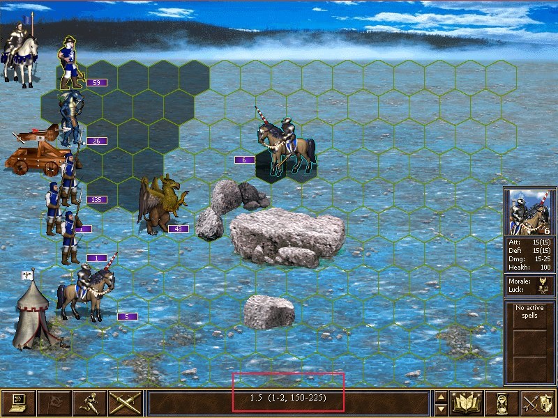
H3 is simple and effective. Not much eyecandy, the focus is on the battle, everything is visible and easy to identify. There, I agree. This H6 battle screenshot is not zoomed in:

And I can still see everything. H7's Beta was, again, not very promising on this part and I hope they fix it. H6 however was nothing to be worried about. Stack size is visible, and the environment adds to the atmosphere. The grid system allows you to see how far you creatures can move, and when selecting to attack you can see the damage that will be dealt, along with the number of enemies that will be killed in said attack. Something sorely missed in H3, really.
TOWN SCREENS:
Again, H3 is clear and visible. Stacked together (not always as logical as it may seem, see H3's Dungeon).

This is not a fully built Necro town, but the several dwellings are easy to spot. The Boneyard, Sepulcher, Crypt...and where is the Ghost tower? Oh, in the corner, hidden in fog and mist, on a cliff. Yes, this town too has some elements other than just creature buildings. The lack of real non-military dwellings is indeed a sad thing (although...next to the Sepulcher is an area that looks like an excavation site). But there are rocks, cliffs, and elements in the landscape.
Elvin said:
Champion dwellings were highlighted and you could tell they were special
That goes for H3's Portal of Glory without a doubt, but I think that the Titan dwelling in Tower and the Dragon Cave in Dungeon are a bit tucked away. They are there, but to say they stand out among the others? Hm....I'm not sure.

A clear road leading to the city. Sufficient hints of pathways and roads imo.
Once you learn to know each building and the way the city is constructed, finding what is where is not all too hard .
--
But really, the air of "Almighty H3" is strong in this topic. Come on, what once was no longer is, as was made clear by the dawn of H5. There is an evolution going on, and the new games aren't even made by the same developer and therefore do not always follow the same ideas and styles. If Heroes would remain as static, while other games continue to evolve, I think it would quickly fall by the wayside. The art evolves with technology, and it's clear that the franchise evolves in more than one way, and quickly at that. I say, don't stick too much to Holy H3 and learn to look ahead, and accept that not everything is going to be like it once was. Because only wanting to go back rather than forward is stalling the progress of the game.
I don't say that H3 should be disregarded altogether (the topic of hero specials for one), but should also not be considered as the holy grail. Imo, every game has its own ups and downs, and one game feels differently from the other in its own way. But in the end, the game is still Heroes of Might and Magic, and to me it feels true to its very core.
But there will never be an agreement between us about this anyway .
____________
|
|
frostymuaddib

Promising
Supreme Hero
育碧是白痴
|
|
posted August 11, 2015 12:16 PM |
|
|
I higly agree with everything that Elvin posted.
____________
"Occam's shuriken: when the answer is elusive, never rule out ninjas." -- Dr. Gordon Freeman (Freeman's Mind)
"lol" -- VERRIKER VON ERWINSSEN
|
|
Salamandre

Admirable
Omnipresent Hero
Wog refugee
|
|
posted August 11, 2015 12:24 PM |
|
|
Dies_Irae said:
And H3's recruiting lacks in one big aspect: you cannot recruit everything at once, like in H4 and onwards.
Dies_Irae said:
The grid system allows you to see how far you creatures can move,
Dies_Irae said:
and when selecting to attack you can see the damage that will be dealt, along with the number of enemies that will be killed in said attack. Something sorely missed in H3, really.
True, all those were added by fans later. But it would look awkward if UBI ignores in 2015 tweaks H3 already has.
|
|
Dies_Irae
Supreme Hero
with the perfect plan
|
|
posted August 11, 2015 12:36 PM |
|
|
It's too easy to bring mods to the party. Of course, fans have changed things over time and added stuff that didn't exist in the official release. But I focused on the official content, and the official H3 does not have the recruit-all feature.
I don't think it's valid to use a mod as a counter-argument. A mod is by definition not official. Yes, Ubi can learn (and probably did when they implemented Town Conversion in H6), but still.
____________
|
|
kiryu133

Responsible
Legendary Hero
Highly illogical
|
|
posted August 11, 2015 12:39 PM |
|
|
As SG said, I think H4 is better to focus on when it comes to UI...
____________
It is with a heavy heart that I must announce that the cis are at it again.
|
|
Galaad

Hero of Order
Li mort as morz, li vif as vis
|
|
posted August 11, 2015 12:43 PM |
|
|
@Dies Irae
So fans make corrections themselves but we have to ignore it? I cannot understand the logic here.
____________

|
|
Salamandre
Admirable
Omnipresent Hero
Wog refugee
|
|
posted August 11, 2015 12:47 PM |
|
|
Dies_Irae said:
It's too easy to bring mods to the party.
You used the verb (miss, doesn't have etc) at present time. Or, in the present, HoMM3 lacks nothing which other Heroes games have, generally speaking. Also if only they inspected closely all mods created, they would have a easier time to understand how to make a good game. That's all, from my point of view.
|
|
kiryu133
Responsible
Legendary Hero
Highly illogical
|
|
posted August 11, 2015 12:50 PM |
|
|
ALL mods!?
Maybe limit it to the most popular?
____________
It is with a heavy heart that I must announce that the cis are at it again.
|
|
Salamandre
Admirable
Omnipresent Hero
Wog refugee
|
|
posted August 11, 2015 12:52 PM |
|
|
|
Well sure, I am generalizing. Only complaining about their lack of curiosity. If people continue to improve a game 16 years after release, it means it is worth a look.
|
|
Storm-Giant
Responsible
Undefeatable Hero
On the Other Side!
|
|
posted August 11, 2015 01:05 PM |
|
|
Dies_Irae said:
And H3's recruiting lacks in one big aspect: you cannot recruit everything at once, like in H4 and onwards. This is possible in H6, and you even get an indication of what it might cost (automatically it will buy the powerful units first, I believe).
It does, but that does in no way disregard everything else H2-4 Recruitment screens were superior at.
H3 RS lacks that feature because it wasn't thought at the time or the technology wasn't there. The same reason creatures didn't had spellbooks, abilities weren't clickable (to learn more about them) and so on. A lot of stuff is very simple in H1-3, but it doesn't make it bad. It's just primitive, archaic.
H4 has ben awfully ignored for being regarded as the Black Sheep of the series for a long time (until H6), but if you look closely, H4 improved the formula the previous 3 games laid out.
Mind you, not everything was improved in h4. The combat as a whole was awful xD. But there's still so much to learn from.
____________
|
|
frostymuaddib
Promising
Supreme Hero
育碧是白痴
|
|
posted August 11, 2015 01:23 PM |
|
|
Dies_Irae said:
It's too easy to bring mods to the party. Of course, fans have changed things over time and added stuff that didn't exist in the official release. But I focused on the official content, and the official H3 does not have the recruit-all feature.
I don't think it's valid to use a mod as a counter-argument. A mod is by definition not official. Yes, Ubi can learn (and probably did when they implemented Town Conversion in H6), but still.
I suggest that you also use mods for Ubi's HoMM games as part of arguments. IMO, mods are essential part of Heroes games, so I don't see anything wrong in using them when comparing games.
____________
"Occam's shuriken: when the answer is elusive, never rule out ninjas." -- Dr. Gordon Freeman (Freeman's Mind)
"lol" -- VERRIKER VON ERWINSSEN
|
| |
|
|