| Proposition for New HC Design |  This thread is pages long: 1 2 · NEXT» This thread is pages long: 1 2 · NEXT» |
|
RedSoxFan3


Admirable
Legendary Hero
Fan of Red Sox
|
 posted May 02, 2006 02:20 PM
 |
|
|
Proposition for New HC Design
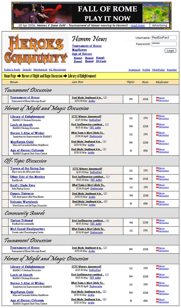
I took a course called Rhetoric of Visual Design this past term and one my my assignments was to redesign an advertizement, newspaper, website, or any other thing that relies heavily on print.
So you guessed it I decided to make a new layout for HC and I think it came out quite nicely. Tell me what you all think. This is obviously an incomplete version and I could do more work on this at a later point in time to improve it more.
____________
Go Red Sox!
|
|
Lord_Woock

Honorable
Undefeatable Hero
Daddy Cool with a $90 smile
|
|
posted May 02, 2006 02:24 PM |
|
|
Ugh. Did anyone ever tell you what happens when you mix too many different fonts? To be honest, I would never want HC to look like that. Still, I apreciate the effort 
Try again  Practice makes perfect! Practice makes perfect!
|
|
TNT_Addict

Honorable
Supreme Hero
Beautiful Liar
|
 posted May 02, 2006 02:25 PM
 |
|
|
|
RedSoxFan3
Admirable
Legendary Hero
Fan of Red Sox
|
|
posted May 02, 2006 02:27 PM |
|
|
Quote:
Ugh. Did anyone ever tell you what happens when you mix too many different fonts? To be honest, I would never want HC to look like that. Still, I apreciate the effort
Try again Practice makes perfect!
Mixing fonts is a common practice there Woock. Read any book on visual design.
Edit: I experiemented with the rules a bit. The top has just the verticle rules, which is my favorite. Then the middle has both horizontal and verticle rules. The bottom obviously sucks as it has no rule.
____________
Go Red Sox!
|
|
Lord_Pc

Promising
Famous Hero
Groin-Grabingly Clever
|
|
posted May 02, 2006 02:38 PM |
|
|
a few problems
1) the yellow bar is hard to read. change the font
2) take bold of those threads down the middle. small size and bold print dont go together
3) the links at the top r underlined and then are underlined again with dots. doesnt look good
4) at the top there are these *** that hide members passwords. dont see the need for that 
____________
Da-da-dada-HEY-dada-da-da
Two goldfish were in their tank. One turns to the other and says, 'You man the guns, I'll drive.'
|
|
kookastar

Honorable
Legendary Hero
|
|
posted May 02, 2006 02:43 PM |
|
|
|
Who am I anyway, but I agree - too many different fonts.
|
|
RedSoxFan3
Admirable
Legendary Hero
Fan of Red Sox
|
|
posted May 02, 2006 02:46 PM |
|
|
I won't get rid of the bold. It's there for a reason. The thread title needs more emphasis. The problem was that MS Paint had a bad selection of fonts. Next time I'll be using MS Publisher.
When I made this, the main idea was to give the board more contrast and energy. Right now it seems a bit subdued.
____________
Go Red Sox!
|
|
RedSoxFan3
Admirable
Legendary Hero
Fan of Red Sox
|
|
posted May 02, 2006 02:49 PM |
|
|
Quote:
Who am I anyway, but I agree - too many different fonts.
Well I'll see what the professor says. Too many fonts is incorrect. If there is an issue it is likely that the fonts are conflicting with each other, because they are too similar or project different messages.
____________
Go Red Sox!
|
|
kookastar
Honorable
Legendary Hero
|
|
posted May 02, 2006 02:52 PM |
|
|
Well I'll see what the professor says. Too many fonts is incorrect. If there is an issue it is likely that the fonts are conflicting with each other, because they are too similar or project different messages.
OK sure proff, then I agree the fonts are conflicting with each other, because they project different messages 
|
|
mr_niceguy

Famous Hero
of power
|
|
posted May 02, 2006 03:06 PM |
|
|
Maybe you should try put gradients in, gradients make everything look good.
____________
a stich in time saves nine... what the hell does that mean?
If u enjoy telling ur friends of how uve never been beaten with ur own legs, u'd rethink making a comment
|
|
Consis

Honorable
Legendary Hero
Of Ruby
|
|
posted May 02, 2006 03:40 PM |
|
|
LoL . . .
I'm the only one who likes it. ha ha ha!
____________
Roses Are Red And So Am I And So Am I
|
|
Lord_Woock
Honorable
Undefeatable Hero
Daddy Cool with a $90 smile
|
|
posted May 02, 2006 04:55 PM |
|
|
That's because you have no taste whatsoever!
...Hey, that would explain why you find me amusing 
|
|
I_HaT3_CT

Adventuring Hero
XJapan Fan (Rusty Nails)
|
|
posted May 02, 2006 05:12 PM |
|
|
Thats actually very nice, except that the Big Italic font is not very suitable to go with the forum. Others are all quite ordinary.
7.5/10
However, my main interest is about the top right hand corner where the password is being flashed as *. Maybe i will try to guess the password any well
____________
METAL!! Addict. The Music Maniax of Asia. Band of Choice -- (XJapan, Metallica and Iron Maiden)
|
|
RedSoxFan3
Admirable
Legendary Hero
Fan of Red Sox
|
|
posted May 02, 2006 05:54 PM |
|
|
Go for it I don't care about anyone stealing this password not that you would guess it anyhow
____________
Go Red Sox!
|
|
friendofgunnar

Honorable
Legendary Hero
able to speed up time
|
|
posted May 02, 2006 05:55 PM |
|
|
This is Godawfull
1. Peoples mouses are usually on the right side of the screen, near the scroll bar. you need to have the todays posts, search, member list, hc messenger on that side instead of the left.
2. Homm news doesn't need to have a girly font, or be bigger for that matter
3. Heroes community also doesn't need to be that big. it's a waste of space
4. You don't need any special font for where you're currently at (Home Page, Heroes of Might and Magic, Library of Enlightenment)
5. Same thing goes for the broad headings. (Tournament discussion, Heroes of Might and Magic discussion etc…) This might work if all these header fonts were the same subtly cool font, but their not.
Last but not least, it doesn't need to be changed. What you're doing is the same thing that every freakin computer programmer on the face of the planet cept Val feels they have to do, which is to add bloat to something that doesn't need it. Bells and whistles whoohah! look at the pretty colors!
BOLLOCKS!
|
|
RedSoxFan3
Admirable
Legendary Hero
Fan of Red Sox
|
|
posted May 02, 2006 06:53 PM |
|
|
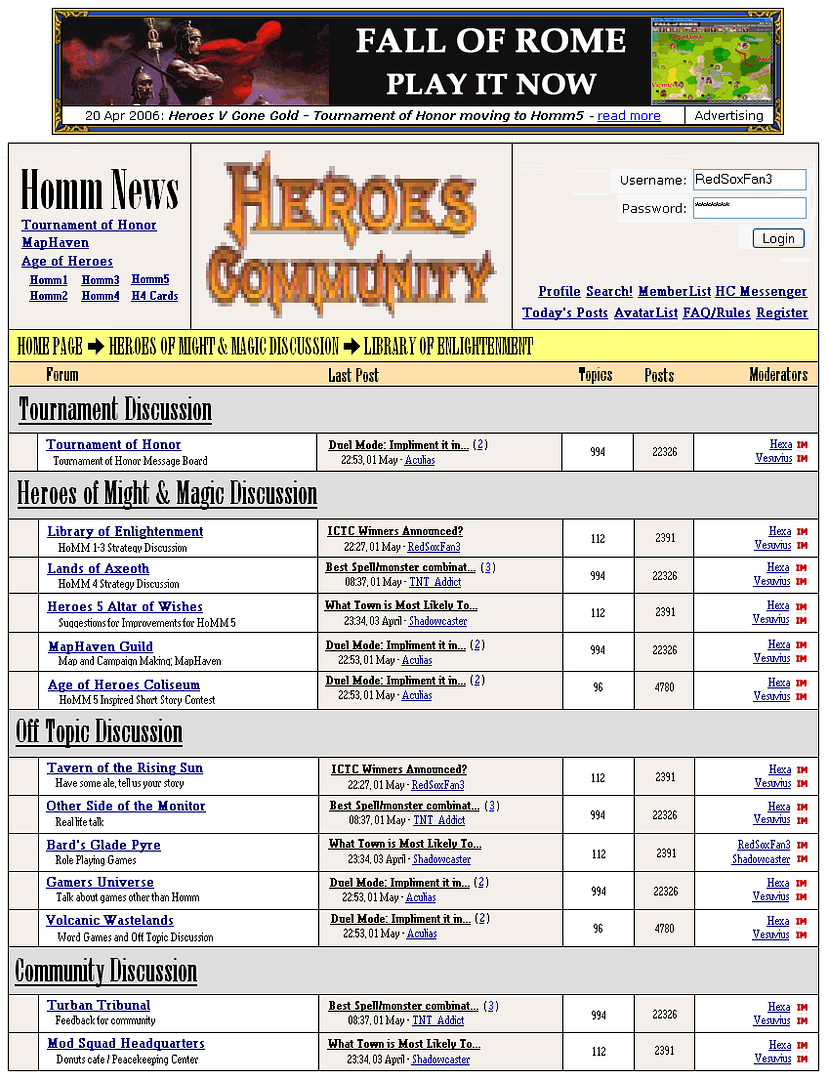
Version 2.0
____________
Go Red Sox!
|
|
RedSoxFan3
Admirable
Legendary Hero
Fan of Red Sox
|
|
posted May 02, 2006 06:57 PM |
|
|
Quote:
This is Godawfull
1. Peoples mouses are usually on the right side of the screen, near the scroll bar. you need to have the todays posts, search, member list, hc messenger on that side instead of the left.
2. Homm news doesn't need to have a girly font, or be bigger for that matter
3. Heroes community also doesn't need to be that big. it's a waste of space
4. You don't need any special font for where you're currently at (Home Page, Heroes of Might and Magic, Library of Enlightenment)
5. Same thing goes for the broad headings. (Tournament discussion, Heroes of Might and Magic discussion etc…) This might work if all these header fonts were the same subtly cool font, but their not.
Last but not least, it doesn't need to be changed. What you're doing is the same thing that every freakin computer programmer on the face of the planet cept Val feels they have to do, which is to add bloat to something that doesn't need it. Bells and whistles whoohah! look at the pretty colors!
BOLLOCKS!
Way to give no helpful comments. If you want to learn how to post a critique look at I_HaT3_CT's post. He helped me a lot when I went to make my second revision.
____________
Go Red Sox!
|
|
TNT_Addict
Honorable
Supreme Hero
Beautiful Liar
|
|
posted May 02, 2006 07:27 PM |
|
|
|
friendofgunnar
Honorable
Legendary Hero
able to speed up time
|
|
posted May 02, 2006 09:21 PM |
|
|
RedSoxFan there are a lot of things in this world that desperately need your amazing design talents.
HC isn't one of them.
BTW that was a nice edit you made. I was planning on including a hyperlink to my very first post here at HC but now that would just look inappropriate.
[edit]actually this entire post now looks inappropriate, however two hours ago, before RedSoxFan's edit, it was entirely in context and appropriate to boot.
|
|
friendofgunnar
Honorable
Legendary Hero
able to speed up time
|
|
posted May 02, 2006 09:41 PM |
|
|
Before continuing this any further I want to apologize to RSF for the tone of my original critique. The truth is that I am absolutely infuriated by bloat. It's a persistant and everpresent drag on information integrity. It's also one of my pet peeves, and I tend to grind that axe whenever I get the chance. I should have been politer but that was my genuine emotion speaking.
Anyway RSF, keep at it, I'll stay out from now on...
|
|
|
|


