|
| Thread: Civilization 6 is announced |  This thread is pages long: 1 2 3 4 5 · «PREV / NEXT» This thread is pages long: 1 2 3 4 5 · «PREV / NEXT» |
|
alcibiades


Honorable
Undefeatable Hero
of Gold Dragons
|
 posted May 14, 2016 12:56 AM
 |
|
|
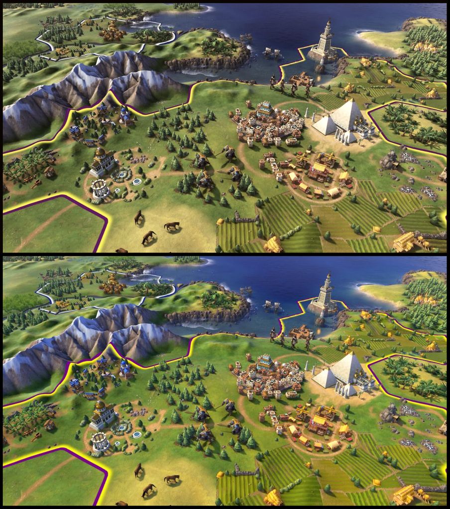
Also, tried to play around a bit with the colours on the screenshots, imo. this definitely improves the look massively.
Edit > Tried to make it somewhat less desaturated, this was the old version.
|
|
Stevie

Responsible
Undefeatable Hero
|
|
posted May 14, 2016 02:24 PM |
|
|
|
alcibiades
Honorable
Undefeatable Hero
of Gold Dragons
|
|
posted May 14, 2016 03:26 PM |
|
|
Stevie said:
Seems more like Heroes 7 Beta saturation, I don't really like it.
Which one of them?
|
|
Stevie
Responsible
Undefeatable Hero
|
|
posted May 14, 2016 03:33 PM |
|
|
|
alcibiades
Honorable
Undefeatable Hero
of Gold Dragons
|
|
posted May 14, 2016 03:44 PM |
|
|
|
Really? Well, try to compare to a screenshot from Civ5 (for instance here), and compare to the images above - which one looks closer to it?
|
|
Stevie
Responsible
Undefeatable Hero
|
|
posted May 14, 2016 04:07 PM |
|
|
|
alcibiades
Honorable
Undefeatable Hero
of Gold Dragons
|
|
posted May 14, 2016 04:11 PM |
|
|
Stevie said:
Hmm... Fair point I guess. But that just goes to show how much of a visual impact the interface has too. Add that over and it's the latter definitely.
Well I agree to an extent: I do agree that interface and icons can have more vivid colours than the terrain in general. Also, in the screenshot, I just toned down saturation globally, which means also nation borders get very desaturated, which I'm not necessarily in favor of. However, the technicolour look of the terrain the show us in the screenshots is for me just plain wrong, not only does it look bad, it's also very stressful on the eyes.
|
|
Corribus


Hero of Order
The Abyss Staring Back at You
|
|
posted May 14, 2016 06:55 PM |
|
|
I've pretty much loved every Civilization, and I'm sure I'll love the next one. Each one manages to capture the essence of the Civ genre but offers enough changes to make it feel special and different.
I sunk hundreds of hours into Civ1, 2, 3, 4, and 5. I'm sure this one will be no different. 
____________
I'm sick of following my dreams. I'm just going to ask them where they're goin', and hook up with them later. -Mitch Hedberg
|
|
kiryu133

Responsible
Legendary Hero
Highly illogical
|
|
posted May 14, 2016 07:04 PM |
|
|
|
I like this new, colourful look. makes things pop more and allows for greater clarity. Not sure about the aesthetics/models though. like you can have colour and such without going full cartoony.
|
|
alcibiades
Honorable
Undefeatable Hero
of Gold Dragons
|
|
posted May 14, 2016 07:19 PM |
|
|
kiryu133 said:
I like this new, colourful look. makes things pop more ...
Actually, that is one of my major objections to the new colours. When you have full-on bang colours everywhere, things DON'T pop up more, quite on the contrary, your eyes get confused, and nothing sticks out.
|
|
kiryu133
Responsible
Legendary Hero
Highly illogical
|
|
posted May 14, 2016 07:53 PM |
|
|
alcibiades said:
Actually, that is one of my major objections to the new colours. When you have full-on bang colours everywhere, things DON'T pop up more, quite on the contrary, your eyes get confused, and nothing sticks out.
That can happen but it depends on how much stuff there is and what colour-combinations are used. I can see how this could be the case for Civ 6 judging by what we've seen but desaturation is not the answer (in fact I personally feel kinda nauseous looking at your desaturized version). As long as the colours are used well by only giving important things clashing colours (units and resources for example) the amount and richness of colours shouldn't be much of a problem but rather, as I said, help guide the player to the things that are important.
looking at your screenshots I know i prefer the lower one since the level of saturation makes different colours pop and as such the things with stronger/clashing colours shows up easier, in this case the marketplace with bright yellows, pyramids just standing out with powerful whites and the soldiers visible against the background where in your desaturized pic everything looks kinda like a yellowish brown smear.
that said, I can get some of the complaints about it going a bit overboard but I don't thing the colours should be subdued as much as the overall art style is a bit too soft or rounded.
|
|
TD

Promising
Famous Hero
|
|
posted May 14, 2016 09:02 PM |
|
|
|
I much prefer the un-saturated version myself. The saturation just makes the game look like it was done with Tablets or some 3DS in mind, looks already way too simplistic and cartoonish.
|
|
alcibiades
Honorable
Undefeatable Hero
of Gold Dragons
|
|
posted May 15, 2016 09:40 PM |
|
|
kiryu133 said:
That can happen but it depends on how much stuff there is and what colour-combinations are used. I can see how this could be the case for Civ 6 judging by what we've seen but desaturation is not the answer (in fact I personally feel kinda nauseous looking at your desaturized version). As long as the colours are used well by only giving important things clashing colours (units and resources for example) the amount and richness of colours shouldn't be much of a problem but rather, as I said, help guide the player to the things that are important.
Actually, that is objectively wrong. It is scientific fact that bright colours will make it harder on the eyes, will make the brain tired, and will make it more difficult to spot specific objects.
Meanwhile, here's an interesting post on Civ-fanatics, someone decided to re-create on of the Civ6 screens in Civ5:


Do the desaturated colours still make you nauseous? 
|
|
kiryu133
Responsible
Legendary Hero
Highly illogical
|
|
posted May 15, 2016 10:08 PM |
|
|
Not nearly as much but it's also not desaturized as much as just less clashing/strong colours/different aestethics completely.
Have you tried reducing brightness instead? Thinking that could be a better solution. Or just tone down syrong colours in terrain. I mean the soldiers look great in that powerful red, right? Really like 'em.
I dunno, maybe i'm the weird one in this but I lovr me some strong saturation 
____________
It is with a heavy heart that I must announce that the cis are at it again.
|
|
alcibiades
Honorable
Undefeatable Hero
of Gold Dragons
|
|
posted May 15, 2016 10:20 PM |
|
|
kiryu133 said:
I dunno, maybe i'm the weird one in this but I lovr me some strong saturation
Well everyone's allowed to have their personal taste. 
Anyway, I tried to update the desaturated version above a bit, to make it a bit more in-between the one I made before and the actual Civ6 version, to try to strike a compromise.
|
|
Gryphs

Supreme Hero
The Clever Title
|
|
posted May 15, 2016 10:49 PM |
|
Edited by Gryphs at 23:09, 15 May 2016.
|
I really do not see any issue with the cartoony and bright style. The graphics are not amazing per say, but seeing them compared to civ5 they actually look more impressive.
____________
"Don't resist the force. Redirect it. Water over rock."-blizzardboy
|
|
alcibiades
Honorable
Undefeatable Hero
of Gold Dragons
|
|
posted May 25, 2016 06:47 PM |
|
|
First game footage is released, and it looks gooooood! 
Part 1
Part 2
|
|
Gryphs
Supreme Hero
The Clever Title
|
|
posted May 25, 2016 09:37 PM |
|
|
I have never been a huge fan of how civilization handled governments; now we have another new system, hopefully it will be more appealing than the past ones.
____________
"Don't resist the force. Redirect it. Water over rock."-blizzardboy
|
|
EnergyZ

Legendary Hero
President of MM Wiki
|
|
posted June 19, 2016 09:21 PM |
|
|
|
Salamandre

Admirable
Omnipresent Hero
Wog refugee
|
|
posted June 19, 2016 09:25 PM |
|
|
|
|
|


