|
|
fred79

      
Disgraceful
Undefeatable Hero
|
 posted February 24, 2013 09:54 AM
 |
 bonus applied by Corribus on 28 Feb 2013. bonus applied by Corribus on 28 Feb 2013. |
Edited by fred79 at 21:51, 16 Apr 2018.
|
Fred79's Object Patch
Feb 2017 upload(doesn't replace anything in any other mods; it only adds 4,756 map objects; and other mentioned below):
FREDOBJ 1.2
screens of only a fraction of what is included:
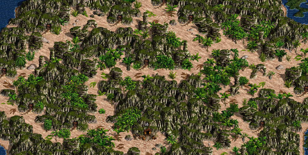
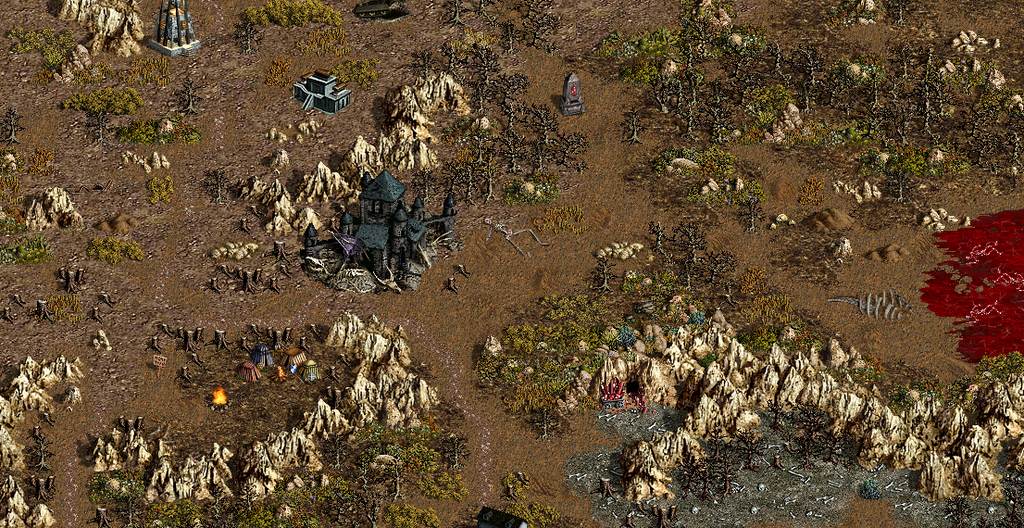
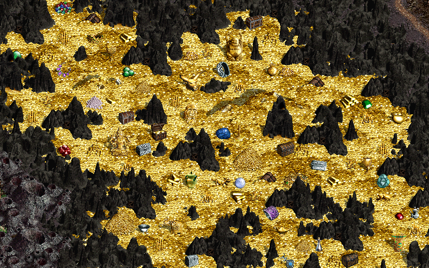
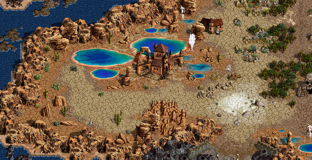
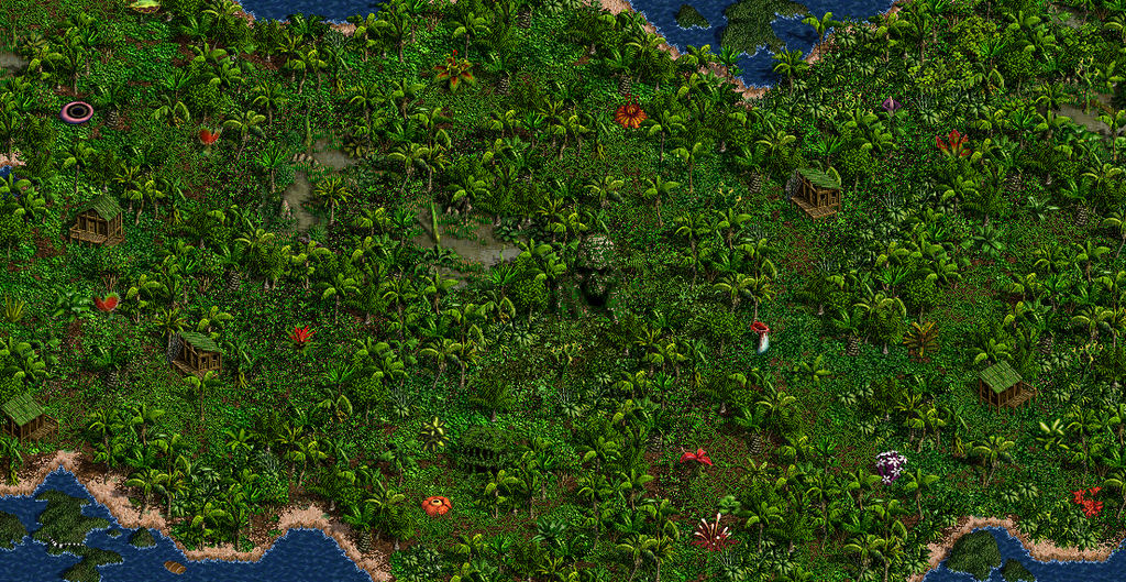
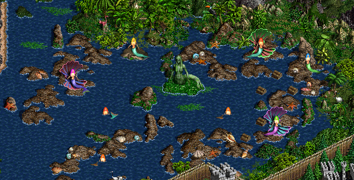
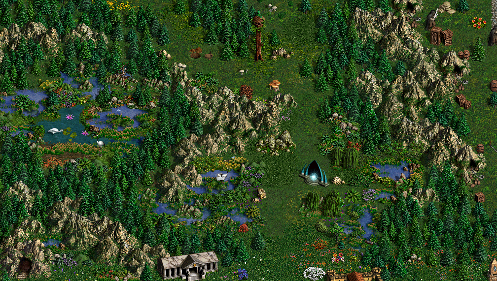
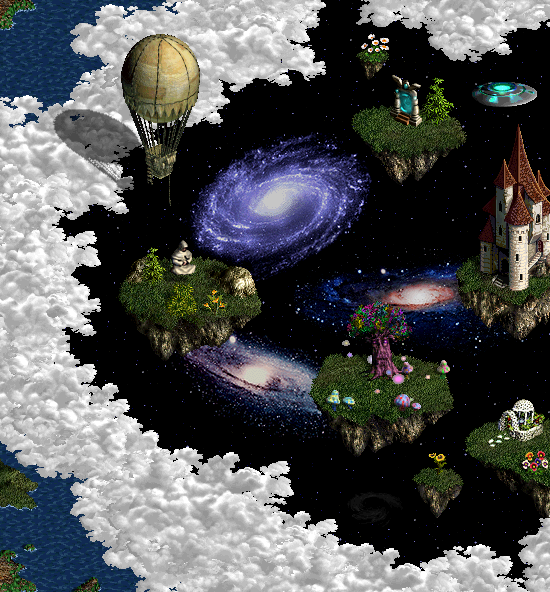
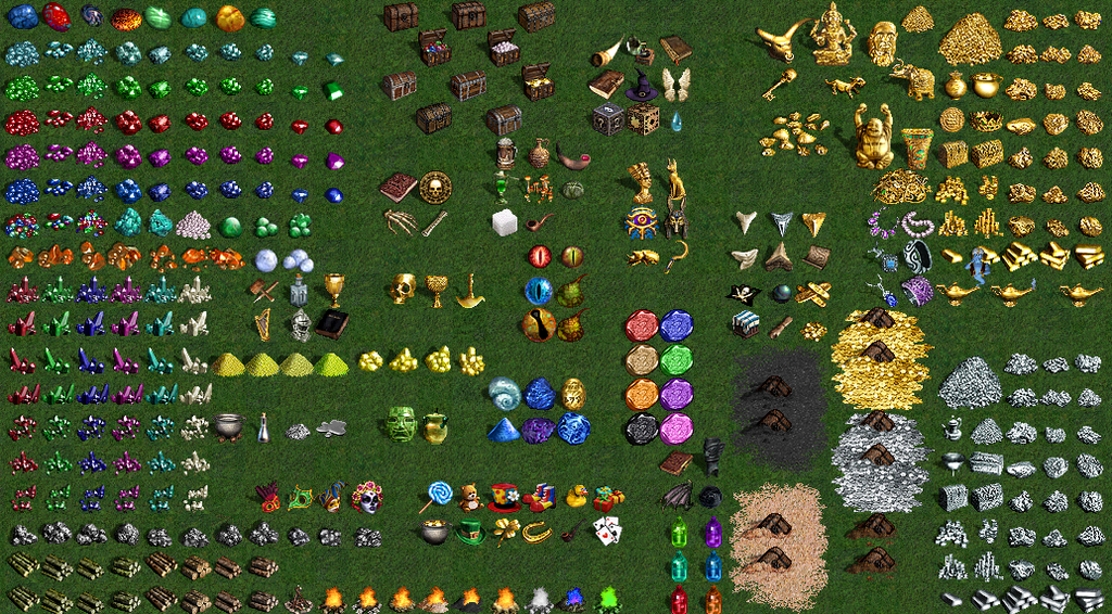
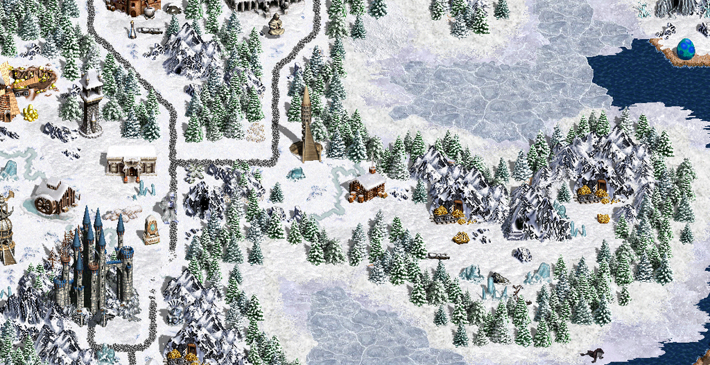
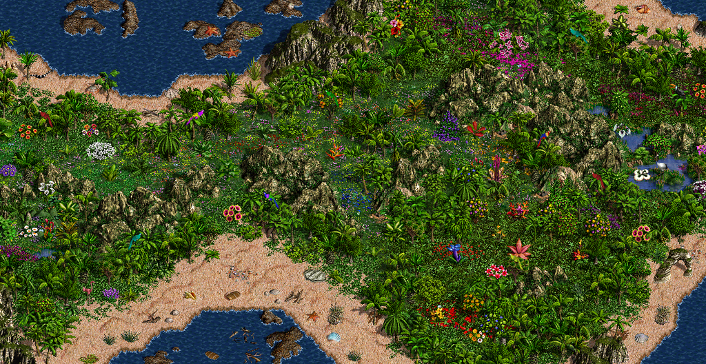
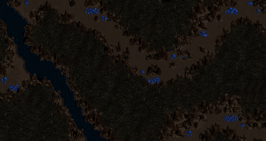
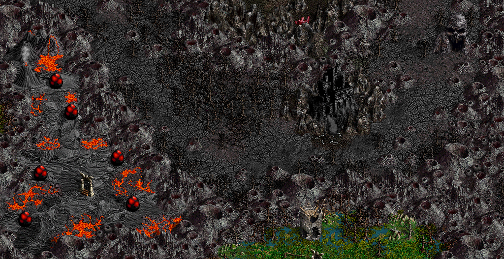
there are a few things included in the mod that aren't pictured here(like some fighter defs), stuff that doesn't go on the map, or belongs in h3bitmap.lod. to locate these things, rename FREDOBJ.exe to FREDOBJ.rar, and open in winrar, or some other .rar program. then you can go thru the .pac to find the things not found in the map editor.
=================
|
|
12345donald


Hired Hero
|
 posted February 24, 2013 12:46 PM
 |
|
|
|
Very cool objects but can you tell me how can i make a town using an object of yours ( picture nr 4 at pics done with these objects)??
|
|
Warmonger


Promising
Legendary Hero
fallen artist
|
 posted February 24, 2013 01:26 PM
 |
|
|
Amazing pack.
Some of objects are somewhat out of palette or style, but still there are hundreds of eye candies remaining 
Quote:
Very cool objects but can you tell me how can i make a town using an object of yours ( picture nr 4 at pics done with these objects)??
Which of these is harder:
1. Making new town, or
2. Changing one picture of finished town
____________
The future of Heroes 3 is here!
|
|
Storm-Giant


Responsible
Undefeatable Hero
On the Other Side!
|
 posted February 24, 2013 02:05 PM
 |
|
|
So many objects, great work fred 
____________
|
|
master_learn


Legendary Hero
walking to the library
|
 posted February 24, 2013 02:13 PM
 |
|
|
Quote:
there are hundreds of eye candies
+1 
____________
"I heard the latest HD version disables playing Heroes. Please reconsider."-Salamandre
|
|
fred79

      
Disgraceful
Undefeatable Hero
|
 posted February 24, 2013 02:23 PM
 |
|
|
thanks, masterlearn.
i am working on the fear castle right now, looking thru the web for inspiration. so far, i have come up with the idea of using my jack-o-lanterns for some visual upgrades(like the graves for the necromancer town screen), either a scarecrow or an impaled corpse for the town grail, and a sanitarium for the maniac. i have come across some pretty wicked haunted houses for a dwelling, also. i have been going thru the h3bitmap and h3sprite for things i need, what i can't find there, i will try to find online.
a future upload will have more spider webs, as well as a nice realistic boar that someone made the battle def for(i made the adventure map version, as well as the pics for the h3bitmap, and used sounds from the web and the h2 boar). i also made a dark ghost, but i am unsatisfied with it, and may use a variation of it for my fear town, so that may not be included in the next upload.
|
|
Bersy


Honorable
Supreme Hero
|
 posted February 24, 2013 02:46 PM
 |
|
|
|
Nice screens, but it would be better to hide them under links or spoilers.
|
|
paulemile


Known Hero
|
 posted February 24, 2013 04:18 PM
 |
|
|
Nice !
As Warmonger said, some objects may not fit, but it doesn't matter. Lots of them (a swarm  ) are really beautiful. I am definitely adding them to my editor. ) are really beautiful. I am definitely adding them to my editor.
|
|
Warmonger


Promising
Legendary Hero
fallen artist
|
 posted February 24, 2013 06:45 PM
 |
|
|
- Green clouds at swamps have too high contrast (or saturation?)
- Bodies on massacre screen are just completely out of style of H3
- Many objects have questionable size / proportions when compared to H3 objects
In general, H3 defs are somewhat rough ans sharp, while some of your structures are too clean. Especially wooden palisade.
____________
The future of Heroes 3 is here!
|
|
FallenAngel


Hired Hero
Erathia Guard
|
 posted February 24, 2013 07:46 PM
 |
|
|
|
fred79, my congratulations! You're inventor of h3 grunge mapmaking style.
|
|
12345donald


Hired Hero
|
 posted February 25, 2013 02:22 PM
 |
|
|
Okay the 5th pic of work done with these objects( the dark version of tower) can you tell me how can i use that object as a necro town? 
|
|
karen


Adventuring Hero
|
 posted February 26, 2013 05:26 AM
 |
|
|
Sorry,I can't download it,can you give me a new address?
I think these objects will bring me many benefits.Can you upload the files to another website(such as Wogarchive)?

|
|
FallenAngel


Hired Hero
Erathia Guard
|
 posted February 26, 2013 12:17 PM
 |
|
|
|
players.pal defines the interface color
|
|
Warmonger


Promising
Legendary Hero
fallen artist
|
 posted February 26, 2013 12:34 PM
 |
|
|
The interface is coloured at run time, there is no image for it. You need to use hex editor to find hardcoded value of player color.
____________
The future of Heroes 3 is here!
|
|
karen


Adventuring Hero
|
 posted February 26, 2013 03:08 PM
 |
|
|
Can you upload it into wikisend?
I can download it there,thank you.
|
|
Salamandre


Admirable
Omnipresent Hero
Wog refugee
|
 posted February 26, 2013 03:45 PM
 |
|
|
|
China blocks mediafire, youtube, imageshack and most others.
|
|
karen


Adventuring Hero
|
 posted February 26, 2013 03:51 PM
 |
|
|
Quote:
will do, karen. i couldn't begin to understand why you can't download, tho. i thought mediafire was universal. 
wow, that was quick. here's the link, karen:
link
Thank you.
I can download it when I'm in Australia.
But I'm in my hometown now.
I think it is a problem.
|
|
Storm-Giant


Responsible
Undefeatable Hero
On the Other Side!
|
 posted February 28, 2013 08:58 AM
 |
|
|
Congrats on your shiny, Fred 
____________
|
|
Chagoux


Hired Hero
|
 posted March 02, 2013 12:58 AM
 |
|
|
|
I really like the idea of changing interface colours, may I ask which tool was used for it ? Thanks in advance
|
|
brink99


Hired Hero
|
 posted March 02, 2013 10:54 PM
 |
|
|
Wow... too much eye candy 
Great work man!
Few observations if you don't mind -
Buildings in the first screen look bad in heroes 3 except maybe the mill and the house to the left of the cross are nice.
The flags from the 3rd screen and the 3 white buildings near them. The fences (for animals) also look kinda very meh.
The tiger, lion, deer and maybe bear can be scaled down in size. Also not sure about the floating iceberg, its just in an entirely wrong perspective. And the diabloesque images of corpses could be scaled down and maybe even combined for more variety so its not just 1 body per terrain object. Just an idea.
Really love the multitude of new terrains. The new spiderweb landscape looks pro, blends very well together. Good job there 
The screenshot with all the golem dwellings look very nice and in the style of forge, but that weird building on the far right just does not fit at all graphics wise. And the corner of a building on the far left also does not fit, I think its the building from the first screenshot.
The snow road looks amazing. So does the swamp terrain, grass terrain, spider/dark terrains. The diablo ones (except blood terrain/red rain effects) feel foreign to heroes 3 style graphics, but w.e. I guess. Maybe its just that I am not used to Heroes 3 being a game with lots of gore.
Really nice work though. Keep it up!
|
|
|
|


